Are you ready to stay ahead of the game in infographic design? As we approach 2023, new trends and techniques are emerging that can take your infographics to the next level. From 3D visuals to virtual reality storytelling, the possibilities are endless. In this post, we'll break down the top infographic design trends for 2023, explore how to effectively use infographics in your marketing strategy, and provide tips on creating memorable and engaging visuals. Get ready to discover the future of infographic design!
Breaking Down the Top Infographic Design Trends of 2023
Infographic design is constantly evolving, and 2023 is no exception! Stay ahead of the game by exploring the hottest trends in infographic design. From 3D visuals to minimalist designs, discover the most popular infographic styles for 2023. Don't miss out on the latest design techniques that can make your infographics stand out from the crowd!
How to Use Infographic Design in Your Marketing Strategy for 2023
Infographic design is a powerful tool for marketing and incorporating it into your strategy can make a big impact. Here are some tips on how to use infographic design effectively:
- Identify your message: Before creating your infographic, clearly define your message and the main points you want to convey. Make sure your design will resonate with them.
- Choose the right data: Select data that is both relevant and interesting to your audience. Use charts, graphs, and other visual aids to make the information more engaging and easier to understand.
- Create a stunning design: Infographic design is all about visuals, so make sure your design is eye-catching and easy to read. Use a color scheme that complements your brand and select fonts that are easy to read.
- Promote your infographic: Once your infographic is complete, promote it through your social media channels, blog, and other marketing materials. Encourage your audience to share and engage with the content.
By incorporating infographic design into your marketing strategy, you can effectively communicate complex data and information while increasing brand awareness and engagement rates. Don't miss out on the benefits of this powerful marketing tool in 2023!
Maximizing the Power of Colors in Infographic Design
Colors can make or break an infographic, as they play a vital role in conveying information and evoking emotions in your audience. To maximize your use of colors in infographic design, consider the following:
Choose Colors That Enhance Your Message
The colors you choose should be based on your message and the emotion you want to evoke in your audience. Consider using color psychology to your advantage by selecting hues that align with your message. For example:
- Red: passion, excitement, energy
- Blue: trust, security, calmness
- Green: growth, health, nature
- Yellow: happiness, optimism, warmth
Incorporate Color Trends in Infographic Design
Stay up to date with the latest color trends in infographic design for 2023, which may include:
- Gradients: blending multiple colors together to create a seamless transition
- Muted Colors: softer shades that evoke a sense of calmness and tranquility.
- Neon Colors: bright and bold hues that add energy and excitement to your design.
Balance Colors Effectively
Using too many colors in your infographic can be overwhelming and distracting. Instead, use a limited color palette and balance your colors effectively to create visual interest and hierarchy. Consider using one color as your primary focal point and complement it with neutral colors or accents.
By maximizing the power of colors in infographic design, you can effectively communicate your message and create visually impactful and memorable designs.
The Evolution of Typography in Infographic Design for 2023
Typography is an essential element in infographic design, and it's constantly evolving. In 2023, we'll see some exciting changes in typography that will impact the way we design infographics.
Stay up to date with the latest typography trends in infographic design for 2023.
As we move into 2023, we'll see a shift towards more experimental typography in infographic design. Bold and playful typefaces will dominate, as designers push the boundaries of what's possible with typography. We'll also see a trend towards mixing different typefaces to create a more dynamic visual hierarchy in infographics.
When choosing typefaces for your infographics, consider pairing serifs with sans-serifs for a balanced look. You can also experiment with using different weights and sizes of the same typeface to create contrast and interest.
Use typography to create a cohesive visual language.
Typography is a powerful tool for creating a cohesive visual language that reinforces your brand identity. In 2023, we'll see a trend towards designing custom typefaces that are unique to each brand. These custom typefaces will be used across all marketing materials, including infographics, to create a consistent visual language that reinforces brand recognition.
When designing custom typefaces, consider your brand's personality and values. Use typography to communicate these values visually, and to create a brand identity that is instantly recognizable.
Balance different typefaces to create visual interest and hierarchy in your infographics.
When designing infographics, it's important to create a visual hierarchy that guides the viewer's eye. Typography is a powerful tool for achieving this, as different typefaces can be used to create contrast and interest. Use bold typefaces for headings and subheadings, and lighter typefaces for body copy.
Experiment with size and weight to create a dynamic visual hierarchy that guides the viewer's eye through the infographic. Remember that typography is just one element of infographic design and should be used in conjunction with other design elements to create a cohesive and engaging visual experience.
The Art of Creating Custom Illustrations in Infographic Design
Custom illustrations can elevate your infographics to the next level and help convey your message in a unique way. Creating your own illustrations may seem daunting, but it can be achieved with some basic design skills and creativity.
How to Create Compelling Custom Illustrations for Infographics
- Start with a clear idea of what you want to communicate.
- Sketch rough ideas of your illustrations to get a sense of layout and composition.
- Choose a style that matches your brand identity and message.
- Use colors that complement your message and evoke the right emotions in your audience.
- Experiment with different techniques, such as watercolor, line art, or digital illustration
Remember to keep your illustrations simple and easy to understand and use them to enhance your message rather than overwhelm it.
Choosing the Right Illustration Style for Your Infographics
There are many different illustration styles that can be used in infographic design, including:
- Flat design - simple, minimalist illustrations with a focus on bold colors and geometric shapes
- Hand-drawn - illustrations that mimic the look of hand-drawn sketches or doodles.
- Isometric - three-dimensional illustrations that create depth and perspective.
- Photorealistic - illustrations that aim to replicate real-life objects or scenes.
Experiment with different styles and see what works best for your message and brand.
Using Custom Illustrations to Create a Strong Brand Identity
Custom illustrations can be used to create a visual language that is unique to your brand and helps you stand out from competitors. Consistent use of specific colors, styles, and imagery can reinforce your brand identity and make your content more memorable to your audience.
Remember to keep your visuals cohesive across all platforms, including social media, websites, and print materials.
Using Animation in Infographic Design to Capture Your Audience
Animation is a powerful tool for capturing the attention of your audience and making your infographics more engaging. It can add movement and interest to your visuals, making it easier for your audience to digest complex data and understand your message. Here are some animation techniques you can use in infographic design:
- Explainer animations: Use simple animations to explain concepts, processes, or products
- Charts and graphs: Add animation to data visualizations to highlight key points or trends
- Animated characters: Create custom characters to add personality and humor to your infographics
- Interactive animation: Use interactive elements to encourage user engagement and exploration
When using animation in infographic design, it's important to strike a balance between visual interest and information overload. Make sure your animation enhances your message and doesn't distract from it. Consider your audience and design for their preferences and learning styles. By using animation effectively in your infographics, you can create more engaging content that resonates with your audience and drives better results.
The Ultimate Guide to Data Visualization in Infographic Design
Data visualization is a crucial aspect of infographic design. It's all about presenting complex information and data in an engaging and informative way. But how do you do it effectively? Here are some key tips to help you create compelling data visualizations for your infographics in 2023:
1. Choose the Right Visualization Type
There are many different visualization types to choose from, including bar charts, line graphs, pie charts, and more. Each type has its own strengths and weaknesses, so it's important to choose the right one for the data you're trying to present. Consider the audience you're targeting and what kind of message you want to deliver.
2. Keep it Simple
Simplicity is key when it comes to data visualizations. Avoid cluttering your infographic with too much information or using too many colors and shapes. Keep your design clean and easy to understand, with a clear hierarchy of information.
3. Use Color Effectively
Colors can help highlight important data points and create a visual hierarchy in your infographic. Use colors to your advantage to guide your audience through the information you're presenting. But don't go overboard - too many colors can be distracting and confusing.
4. Show Trends and Comparisons
Data visualizations are great for showing trends and comparisons. Use timelines, comparison charts, and other visualization types to help your audience see patterns and connections in the information you present.
5. Provide Context
Context is crucial when it comes to effective data visualization. Use labels, annotations, and other design elements to provide additional information and context for the data you're showing. This can help your audience better understand the information and how it relates to their lives.
6. Make it Interactive
Interactive data visualizations can be a great way to engage your audience and encourage them to explore the information you're presenting. Consider using animation, clickable elements, and other interactive features to help your audience interact with the data in new and interesting ways.
With these tips in mind, you can create data visualizations that are both informative and engaging in your 2023 infographics. Experiment with different visualization types and design elements to find what works best for your audience and message. And don't forget to keep it simple and focused on the data at hand!
Blending Virtual Reality with Infographic Design: The Future of Visual Storytelling
In recent years, virtual reality has emerged as a powerful storytelling tool, and it's not surprising that it's beginning to make its way into infographic design. Combining the immersive experience of virtual reality with the informational power of infographics creates an entirely new way for audiences to experience data and information.
The Potential of Virtual Reality in Infographic Design
Virtual reality gives designers the ability to create three-dimensional environments that users can interact with. This means that infographics will no longer be limited to two-dimensional graphics, but rather, they can become fully immersive experiences that engage multiple senses. Users can explore data and information in a way that was never before possible, giving them a deeper understanding of the subject matter.
Blending Virtual Reality with Infographic Design
Blending virtual reality with infographic design requires a different approach than traditional infographic design. For example, designers must account for the user's movement within the virtual environment and ensure that the data and information are presented in a way that is easy to interact with. Additionally, designers must ensure that the design elements don't distract from the data and information being presented.
The Possibilities of Visual Storytelling with VR and Infographic Design
The combination of virtual reality and infographic design opens up a world of possibilities for visual storytelling. For example, a virtual tour of a museum exhibit could include interactive infographics that provide additional information about the artwork on display. A business conference could incorporate a virtual reality infographic that visualizes complex data and helps attendees better understand the presentation. The possibilities are endless, and we can't wait to see where this trend takes infographic design in the future.
Incorporating Interactive Elements in Infographic Design for Better User Engagement
Infographics can be made even more engaging by incorporating interactive elements that allow users to explore and interact with data. This not only increases user engagement, but also provides a personalized experience that can make your content more memorable. Here are some types of interactive elements you can use in your infographic design:
- Clickable Icons: Icons and graphics can be made clickable to reveal more information, either in the form of pop-ups or expanding sections within the infographic.
- Interactive Maps: Maps can be interactive, allowing users to click on different regions to reveal more information, such as statistics or data specific to that region.
- Animated Infographics: Animated infographics with clickable elements can provide an engaging and interactive experience for users.
- Interactive Charts and Graphs: Charts and graphs can be made interactive, allowing users to hover over data points or select specific criteria to display different sets of data.
- Interactive Timelines: Timelines can be made interactive, allowing users to click on certain events to reveal more information or links to related articles or resources.
When incorporating interactive elements in your infographic design, it's important to keep the design clean and uncluttered, so that the interactive elements are easy to use and understand by the users. Remember to also test your interactive infographic thoroughly to ensure that it's working smoothly and efficiently.
The Do's and Don'ts of Infographic Design: Learn from the Best and Worst Examples
Infographic design is a delicate art that requires a balance of creativity and data-driven thinking. While there are numerous examples of amazing infographics that hit the mark, there are also plenty of examples that fail to make an impact. Here are some do's and don'ts of infographic design that you should consider:
The Do's:
- Do use a clear and concise message that can be understood by your audience with minimal effort. The focus should be on conveying your data in an organized manner.
- Do make use of white space as it helps organize and highlight your data in a cleaner way.
- Do use a consistent color scheme and typography that aligns with your brand identity.
- Do use high-quality visuals and icons that complement your data.
- Do use humor and creativity to highlight your data and help your infographic stand out from the rest.
The Don'ts:
- Don't use too much data or information that can overwhelm your audience. It's essential to focus on the key points to be conveyed.
- Don't use too many colors and typography styles that can be distracting and disjointed.
- Don't compromise on the quality of visuals and icons because it can impact the credibility of your data.
- Don't ignore the importance of research and data-driven thinking because it ensures that your infographic is factual and informative.
- Don't forget to use a responsive design that can be easily viewed on all devices.
By following these do's and don'ts of infographic design, you can create infographics that engage your audience and effectively communicate your data-driven message. Learn from the examples of both the best and worst infographics to improve your design skills and create impactful visuals that impress.
Conclusion
Infographic design is an ever-evolving field, and 2023 promises to bring exciting changes to the industry. From 3D visuals and minimalist designs to virtual reality and interactive elements, there are a variety of new trends to explore. With the right use of color, typography, data visualization, and custom illustrations, infographics can effectively convey complex information and catch the attention of your audience. So, make sure to incorporate these latest design techniques in your marketing strategies to stay ahead of the curve and make your content more memorable and shareable.
Remember, learning from both successful and unsuccessful examples can help you create effective and engaging infographics. So, stay curious, be creative, and keep experimenting with new design ideas. Your infographics are your visual stories and the better they are, the more memorable they become. Here's to an exciting future of infographic design!
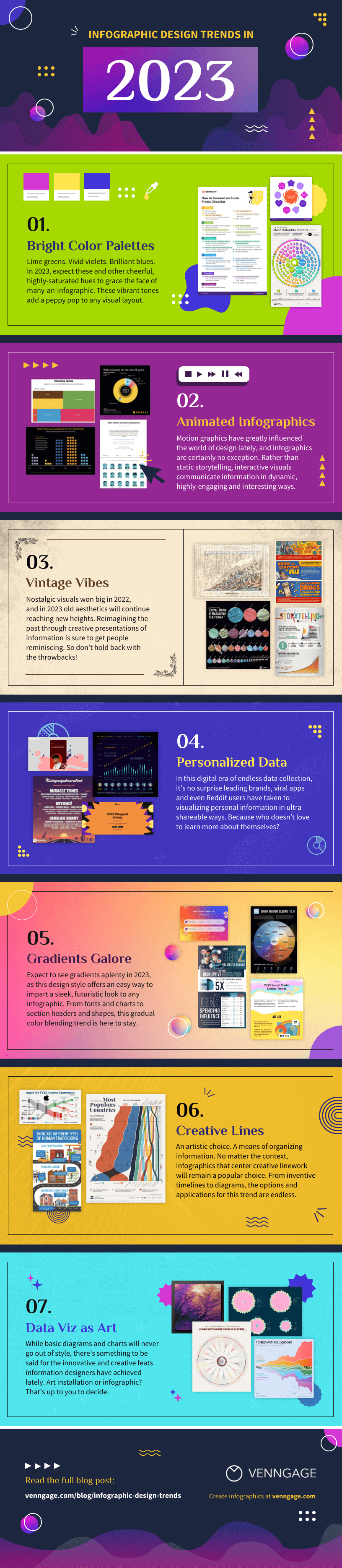
You can also read more about the newest infographic design trends that you can try in 2023 via the following infographic from Venngage.
Related Posts


Built to Bloom Infographics. Visual Storytelling Made Easy!
Visit our store for many inspiring PowerPoint infographic templates, presentation and social media templates.