Image Source: Pexels
Your social media audiences won’t stick around if your visual content is unremarkable.
After all, social media users see hundreds, if not thousands, of posts daily, so if your content doesn’t stand out, your audience can easily ignore you.
You could miss countless opportunities to engage your target audience, and your social media marketing campaigns won’t likely succeed.
The solution? Create compelling and engaging visual content that quickly captures your audiences’ attention and entices them to explore your content and act on your offers.
While nailing your visual content design to successfully promote your small business on social media (among other goals) can take trial and error and constant tweaking, you can jumpstart your initiatives with these five tips.
1. Establish a main focal point
Social media users don’t have time to take in everything in your visuals since most of them scroll through content quickly.
Capture your audience’s attention quickly by getting to the point. Identify your content’s focal point and highlight what you want to convey through your design.
For instance, if you’re launching a digital marketing agency, you can put your promotion or announcement front and center in your visual content, the way the image below does.
Image source: pinterest.com.
Plus, most social media visual formats have limited space, so you’ll need to make the most of it by designing content to focus on your main message.
Once you determine the message you want to get across, identify your content’s focal point and design around it.
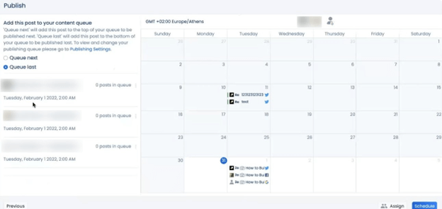
Streamline your visual content distribution across your social media channels with Vista Social.
The social media marketing platform lets you schedule your content to auto-publish on your linked pages such as Facebook, Instagram, LinkedIn, Pinterest, and more.
You can also add your content to a queue to auto-publish multiple posts within a day. You won’t need to post each one on every social media platform manually.
Image source: vistasocial.com.
The automation features can take away a lot of your manual work, so you can focus more on writing amazing content and designing captivating social media visuals.
Vista Social offers a suite of other sophisticated features, from social listening to engagement analytics.
2. Create original illustrations and icons
Design your icons, illustrations, and other graphic design elements and visuals. It’s one of the best ways to make your content stand out from other brands and users on social media.
Most users gravitate toward new and unique things. Leverage this to draw attention to your social media posts and brand, opening up engagement opportunities.
Create unique visuals such as infographics, memes, graphs, videos, images, and other graphical elements that help convey your message while triggering your viewers’ emotions.
Making icons and illustrations can seem daunting if you don’t have an in-house graphic designer or a lick of design skills.
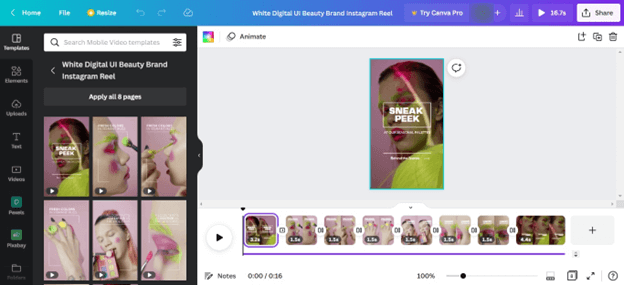
However, you can work around this and create original and beautiful graphic design elements with easy-to-use tools such as Canva.
The graphic design platform offers a wide array of customizable templates and intuitive editing tools to help you create your visual content easily.
Image source: canva.com.
You can also create your visual content and graphic elements from scratch to make one of a kind designs that drive engagement and, ultimately, conversions.
3. Know the visual content design basics
There isn’t a one-size-fits-all formula to creating stunning and engaging social media visual content.
However, there are best practices and design rules to consider to help you nail your designs, including the following tips.
- Remember to apply the rule of thirds. It’s best not to place your subject perfectly at the center all the time.
- Ensure proper image contrasts to provide balance. It can make texts within your images, such as your “How to buy SEO articles” Call-to-Action (CTA), easier to read and your content more accessible, especially in black and white environments.
- Strike a good balance by using natural light and not overexposing your social media images.
- Use complementary colors to ensure your content is visually pleasing and easy to see. For instance, use light-colored text against a dark background.
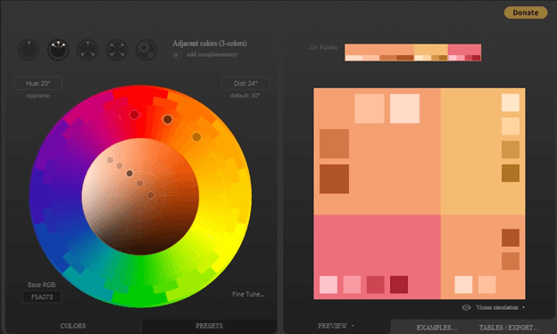
- Use tools such as Paletton, a designer tool with a complementary color wheel. It can help you find color combinations that work well together.
Image source: paletton.com.
- Keep your design simple to ensure your visual content is easy on the eyes while conveying your main message.
- Resist the urge to press all the buttons to avoid over editing, especially when applying filters.
4. Incorporate your branding elements
When designed strategically, your social media visual content can do more than catch your audiences’ attention and drive engagement.
It can also help raise brand awareness and recognition.
The key is to incorporate your branding elements into your designs, such as your icons, logos, color schemes, and others that convey who your brand is to your prospects.
However, don’t get too carried away and plaster your logo in all your visual content.
Subtly is the name of the game, so your branding elements don’t overpower your design and message while allowing you to communicate your brand to audiences visually.
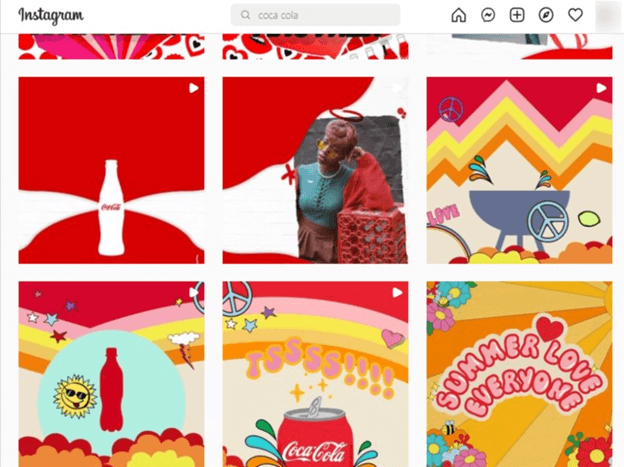
For example, Coca Cola doesn’t always include its famous logo in the company’s Instagram content, but the brand does use its signature #F40009 red in most of its posts.
Image source: instagram.com.
5. Follow image sizes and specs standards
Ensure you follow each social media platform’s specific image size and specs requirements.
Doing so helps you avoid getting the wrong aspect ratio or posting images with low resolutions that can be cropped, stretched, and crunched out of proportion.
It can ruin your beautiful visual content, which can reflect poorly on your brand.
Aim for the highest image quality, including resolution and pixels.
Also, consider the standard aspect ratio of each social media platform, so you avoid getting your images auto-cropped with your important elements and messaging left out.
Follow these quick tips to get your image size, specs, and quality right for each social media platform.
- Avoid placing anything important within your image’s lower and upper 250 to 310 pixels. This way, you can ensure you keep your essential elements and messaging intact.
- Various content can display differently depending on the device. Use social media content analytics to determine the devices your target audiences and followers use and tailor your content’s format accordingly.
- If you don’t have enough room for your content, consider animating the images or using a rasterbator tool to enlarge your images into multiple pages and post your content as a carousel.
Nail your visual content design
A lack of design experience and skills shouldn’t stop you from designing stunning and engaging social media content.
Kick-off your social media visual content design efforts with the reliable tips in this guide.
Pour in time and effort and use the right tools, to create amazing visuals and creatives that amplify your social media marketing initiatives.
Related Posts
Community manager at Visual Contenting. Jacqueline loves to talk about social media trends, new technology and how they help businesses accelerate their marketing efforts.
