In recent years, pop-ups have gotten a bad rap. Some experts say never use them, and others say use them with caution. While users find some pop-ups distracting, there is a time and place for using them to drive conversions.
Exit pop-ups, for example, are a popular exit-intent strategy. Top performing pop-ups have about a 50 percent conversion rate, but the average conversion rates trend toward single digits. Think carefully about when and where pop-ups work best for your target audience.
Combining the power of the call the action (CTA) and the pop-up gives you more opportunities for converting visitors into leads. Some types of CTAs work better than others. Here are six elements that drive pop-up conversions:
1. Offer Updates
One of the most common pop-up offers you'll see time and again on nearly every type of website is the invitation for updates and news on special offers. The message is general, rather than a specific offer, but it works at pulling in the leads. Those who sign up for your mailing list via a more generalized pop-up are more likely interested in your entire product line.
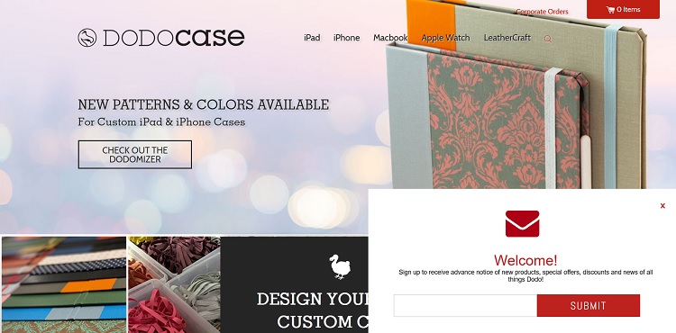
DODOcase uses a CTA pop-up as soon as you land on their homepage. The pop-up invites users to sign up for "advance notice of new products." The brand also indicates the user might receive special offers by signing up for the mailing list. A general pop-up CTA that drives signups for your newsletter casts a wide net and collects names from the traffic landing on your website.
2. Show Some Humor
You can also utilize a pop-up to show a bit of humor to users. Since you'll have additional space, create just the right wording that shows your brand personality.
At the same time, be cautious with how you use humor as not everyone finds the same things funny. Run your light-hearted CTAs past your current customers and do plenty of A/B testing to ensure you aren't offending anyone. Make sure your humor doesn't fall flat.
3. Offer Incentives
Give users some motivation to sign up for your newsletter, and they'll be more likely to give up their personal information, such as their email address. The type of incentive you offer should be something your users value.
Incentives might include a free guide, webinar, discount or contest. Get creative and offer something different than your competitors offer.

Mary Maxim features a pop-up offer to enter for a chance to win $50 in their products. For the crafters visiting their site, the idea of potentially winning free products is attractive. In addition to the contest entry, they indicate signing up for their mailing list lets users in on discounts and exclusive information.
4. Include Images
A pop-up works well with a CTA because you have additional space, which is separate from the landing page. In this space, you can highlight a specific product or place an image of someone using the product. The sky is the limit when it comes to creating a pop-up that drives conversions.
Some pop-ups include a background image, little text and a CTA button. Others add an image along with text on a white background. Make sure there is plenty of contrast between the CTA and the background of your pop-up.
Recommended: Don’t Underestimate the Power of Your CTA
5. Offer a Bonus
People love getting something for free. It puts money in their pockets they otherwise wouldn't have. Just over 60 percent of shoppers indicate coupon offers influence their buying decisions.
The bonus must work with your overall business model, but putting it in terms of a specific dollar amount shows your customers exactly how much the offer is worth. Don't just offer free shipping. Offer "Save $7.95 with Free Shipping."
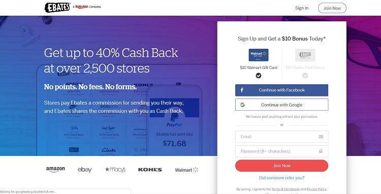
Ebates offers new signups a $10 credit, which works toward a gift card. Not only do they clearly state you'll get a $10 bonus just for signing up in their CTA pop-up, but they show what you can get with that $10, such as a gift card to Walmart. Putting it in those terms shows users exactly what the offer is worth to them. Nearly everyone knows what $10 would buy at a big box retailer.
6. Improve Abandonment Rates
Conversion rates for most sites are in the single digits. Any small thing that improves abandonment rates improves your return on investment (ROI). What if you could capture a percentage of those who bounce away from your site?
Exit-intent pop-ups give you that last chance of reaching site visitors before they leave. Save your best offer for this pop-up as a last-ditch effort to keep them on your site and possibly convert them into customers. Offer the $10 discount on any purchase or free shipping with $50 purchase.
Recommended: 5 Proven Ways to Reduce Shopping Cart Abandonment
Making Your Pop-Ups Fun
Users hate pop-ups that are intrusive and interrupt the flow of engagement. Time your pop-ups, so they appear without disrupting the flow of the buyer journey. Place the pop-up in the lower right corner, so it doesn't cover the entire page or make the box smaller. Wait until the user moves their cursor to the "X" as though they are leaving the page and then throw up a pop-up.
Think about the experience of the user and how the pop-up impacts it before using this CTA technique. Pop-ups don't have to be something your site visitors dread if you plan them out correctly.
Related Posts
Lexie is a designer and typography enthusiast. She enjoys writing HTML code and creating new styles guides. In her spare time, she works on her design blog, Design Roast.
