A business-to-consumer (B2C) website has different considerations than a business-to-business (B2B) site and needs to speak to the needs of the average customer. E-commerce sales amount to about $2.8 trillion globally, and experts predict totals rising to $4.8 trillion by 2021.
Companies spend big bucks making sure their websites are user-friendly and optimized to drive sales. Businesses compete for a limited number of customers, so making minor changes goes a long way toward a more successful B2C website. Tactics for better lead generation require understanding who your customer is and what they want. Here are seven things users want from your site:
1. Users Want Speed
Today's consumer expects lightning-fast page loads. When it comes to keeping customers on your page, loading time makes a significant impact. Abandonment rates increase at the two-second mark, rising sharply to a 25 percent increase in abandonment at the four-second mark.
Speed up your site by optimizing images, investing in a fast web hosting server and reducing the number of scripts on the page. A mere one-second improvement increases the results from your page.
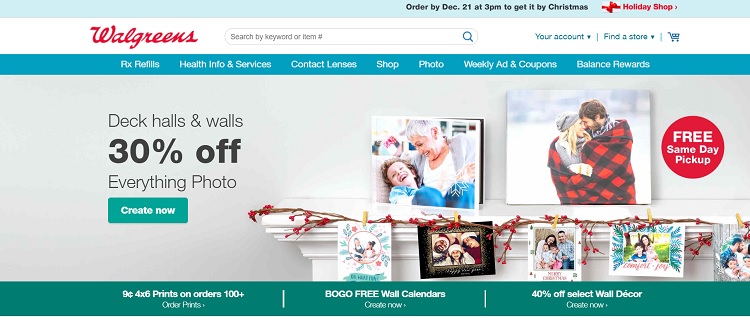
Walgreen's website loads within milliseconds, making visiting the page an almost seamless experience. The average load time is 0.522 seconds, making it the second-highest performing e-commerce site. Note how the site is optimized for your screen size and loads fast whether on a PC or mobile device.
2. Users Want Security
Around 84 percent of people refuse to buy from a website if it isn't secure. Securing your website gains trust from visitors and also helps with Google's new warnings when a user visits a site without a security certificate. Sites such as Let's Encrypt allow users to generate free SSL certificates and make the shift to an HTTPS prefix.
3. Users Want Clear Navigation
The first thing visitors do when landing on your website is look for navigation to determine your site's organization. Users want navigation that is easy to find. Go for clear language over fancy wording, so users understand clicking on the "About Us" button takes them to a page about your company. 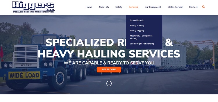 Riggers Inc. has a clear navigation bar appearing at the top of its landing page. Each category is detailed, and a drop-down appears by hovering over the category. For example, when the user hovers over "Services," the types of services the company provides appears — crane rentals, heavy hauling, heavy rigging, etc.
4. Users Want White Space
Cluttered pages aggravate site visitors because the eye never gets a break. Aim for white space, so the user focuses on the elements you want. White space, of course, doesn't just mean white but encompasses any area lacking in text and content.
Adding an even white space in your designs improves comprehension by about 20 percent. White space can be a background image or any texture or pattern, as long as it doesn't make the user think.
5. Users Want Voice Search
More people are using voice search to find what they want online. Devices such as Alexa and Google Home are more popular than ever before, and people also use Siri to do searches. Between 2008 and 2017, voice queries rose by 3,400 percent.
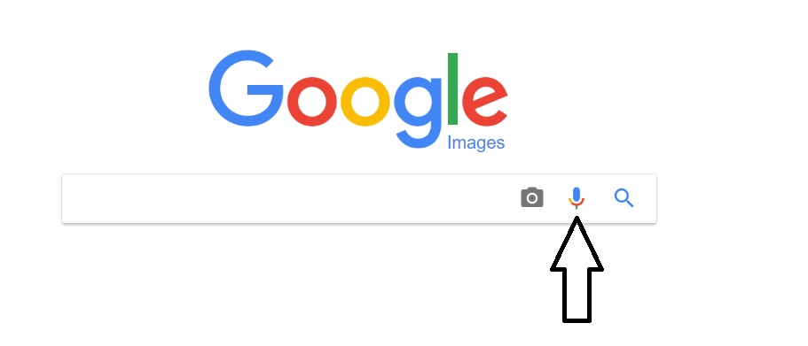
Google Images features audio search. Click on the microphone icon and Google requests access to your microphone. Once you approve access, the site asks you to speak into the microphone and helps complete the search for you.
6. Users Want Social Media Integration
The majority of Americans are on social media of some type and enjoy interacting with brands they like on various platforms. Integrate social media into your website and engage with users.
Add a link to your social media pages, stream your Facebook feed in the sidebar and share content on your social media channels.
7. Users Want Guest Checkout
Users don't always want to share a lot of personal information when placing an order. Offer them the option to complete an order via guest checkout, where they provide only the most basic information.
Keep in mind that payment platforms such as PayPal usually send the mailing address and some necessary information to your e-commerce store when the user pays by that method.
What Users Want
The things users want out of websites change as technology changes. Just 10 years ago, mobile browsing wasn't all that important, but today your site should be mobile optimized or you risk losing potential leads. As technology marches forward and the way we do business online changes, expect what users want from your site to change as well. The seven elements above should give you a good jumpstart.
Related Posts
Lexie is a designer and typography enthusiast. She enjoys writing HTML code and creating new styles guides. In her spare time, she works on her design blog, Design Roast.
