
While users click to your profile to check out your Tweets, the aesthetic choices you make on your page matter just as much. Twitter offers a number of great customization options that are designed to help you represent your business exactly how you want. One of these customization options is our Twitter headers.
All business pages need twitter headers, but designing an awesome twitter header for your business page can easily stump plenty of businesses. Fortunately, by following these 7 tips, you can design an incredible header that will represent your business exactly how you want.

1. Size the Image Correctly
The most important thing to consider when creating a Twitter header for your business is to ensure the image fits the appropriate size requirements. If it doesn’t, large parts of your image will be cropped off, and the image may look distorted.
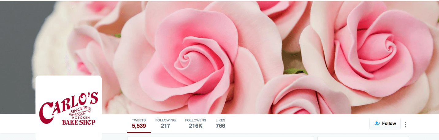
The current Twitter header size dimension is 1500px wide by 500px tall. Even images that perfectly meet this standard, however, face an extra challenge: Twitter will still cut off the top and bottom portions of the image, as seen in the example below.
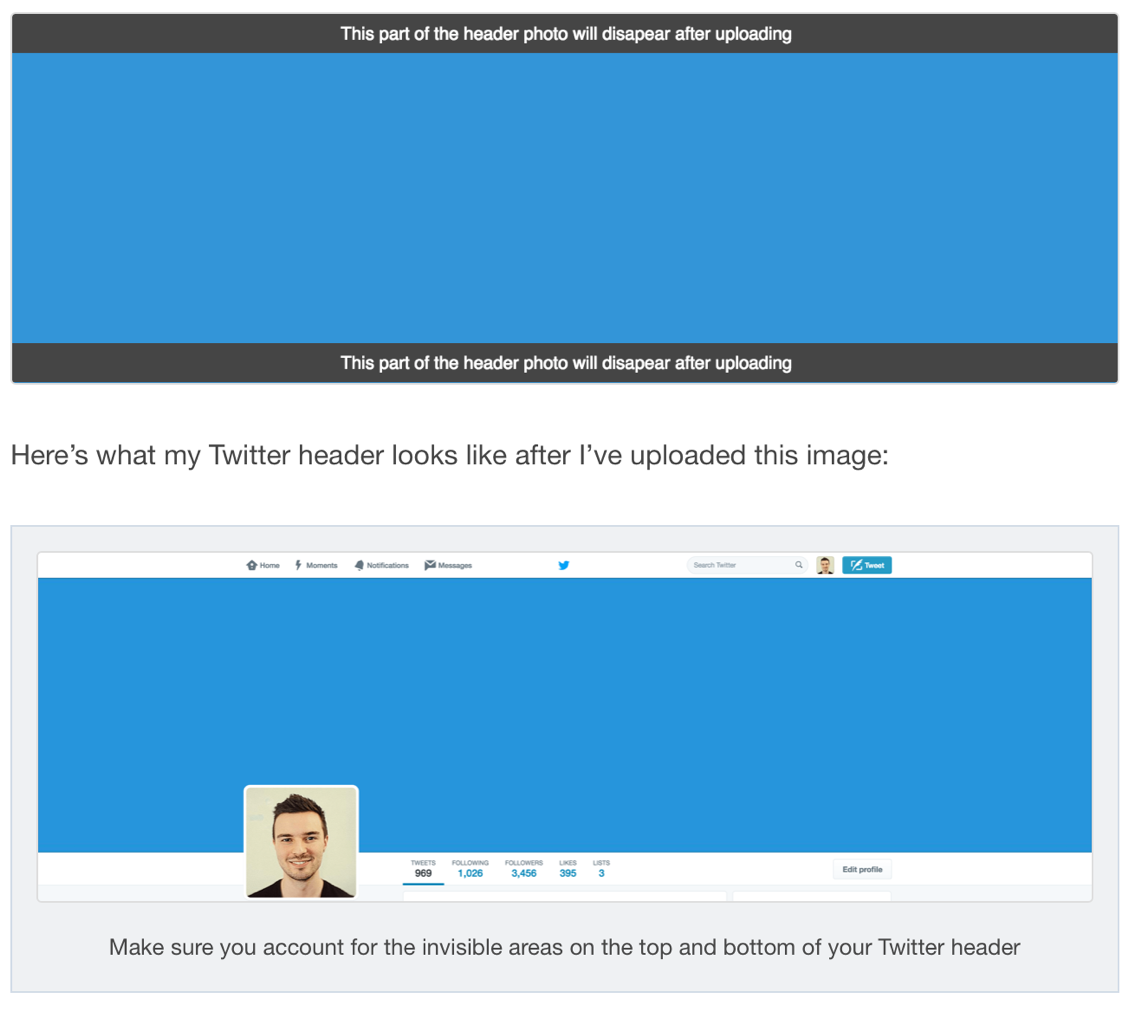
Because of this, prepare for these portions of your image to be cut off, and make sure no crucial design elements are on the very top and bottom of your image.
2. Take the Profile Picture into Consideration
One big challenge with Twitter headers is that Twitter may change the format of profiles and your profile picture may take up space on your header. You should always take current profile formatting into consideration so that your profile picture doesn’t cover an essential part of the image.
In the case of Twitter headers, the profile picture will show in the bottom left corner of the Twitter header. To make things even more complicated, the position of the profile picture will change depending on the size and resolution of your screen. To get around this, you may want to use dedicated Twitter header creator with built-in safe zones.
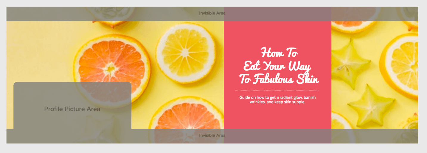
When in doubt, you can have the focus of your Twitter header image be to the right side. This balances out the image while also ensuring that nothing important gets blocked.
3. Choose an Image that Represents Your Brand
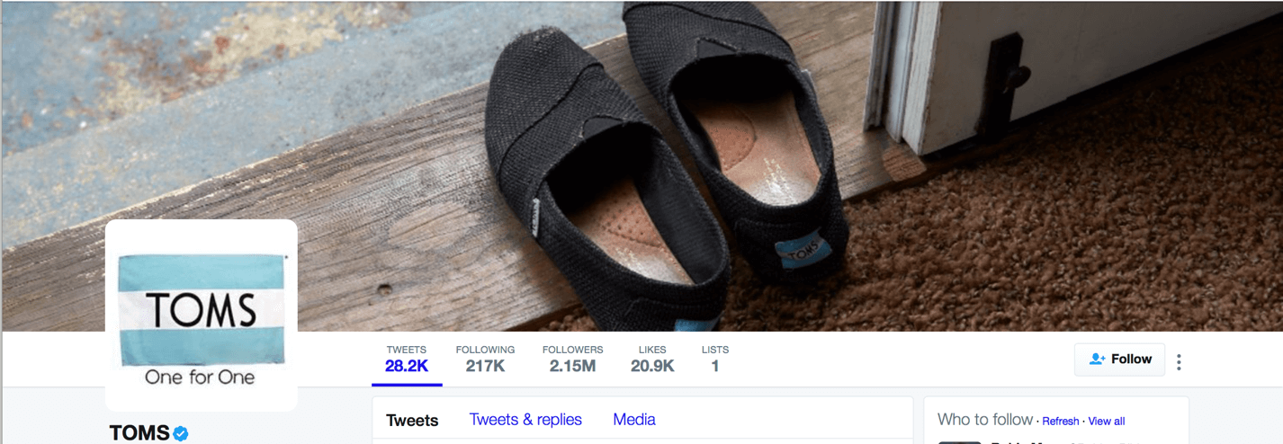
Because your Twitter header should somehow represent your business, it should match your overall branding. You can add your brand’s logo to the image, or choose a header image that matches your brand’s colors. The image from Toms below is a great example of this; they subtly feature the brand’s logo on the shoes, and the colors match the rest of the business page and profile image for a more complete look.
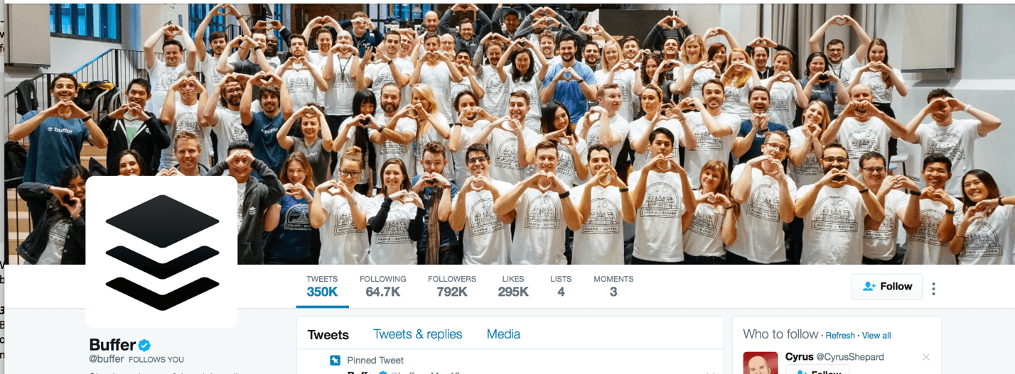
You can also make a statement with your image, choosing to feature what matters most to your brand. Buffer, for example, showcases the importance of their employees by having a picture of the company retreat as their header image.
4. Feature High Quality Images
If you want your business to look professional, it needs to have a high quality image as its header. Photographs should be beautiful and in high resolution, and graphics should be clean and look professionally made.
If you don’t have access to expensive photography equipment or don’t want to hire a graphic designer, there are other options. You can choose an image that matches your brand from stock photo sites; some, like StockSnap, offer stunning high resolution images for free. You can also use design software that lets you easily insert graphics, design elements, and text into background images they have available.
5. Ensure Proper Contrast
One of the most important graphic design tips for people to grasp is contrast. If you’re using light colored text over a light colored background, it’s going to be very difficult to see. The same holds true for dark text over a dark background.
When designing a Twitter header, you need to make sure that your text contrasts with your background in order for the text to be legible.

KISSMetrics does this beautifully with their header by adding a dark overlay over their background image, making the white text pop.
6. Use White Space to Your Advantage
Having “white space” (or, in this case, open space) on your Twitter header can make it easier to direct users’ gaze towards what you want them to focus on. Images with plenty of white space can also look clean and more organized, free of the over-cluttered feeling that can make some images look overwhelming or unprofessional.
Images with plenty of white space make it easier for users to quickly process what they’re seeing by improving content legibility. Since users click to your profile for your tweets and not to see your header image, helping them get the gist quickly before they scroll past is a huge benefit, especially if you’ve got essential information about your brand in your header image.
7. Keep It Simple
Last but not least, it’s always important to keep your Twitter header simple. You’re not trying to win design awards here. Instead, you should be communicated the messaging behind your brand as succinctly as possible.
A great Twitter header can be as simple as a photo of your team or a background image with some text over top. Often times, the simpler the better.
Final Thoughts
Your Twitter Header image could be one of the first impressions users have of your business, so you want to make sure that it embodies your brand. Using high quality, distinctive images that are perfectly proportioned to Twitter’s specifications and match your branding will be the perfect representation of your business.
Related Posts
![content marketing for recruitment pipeline]()
The Power of Content Marketing in Building a Strong Recruitment Pipeline
Content Marketing![Essential Tools and Technologies for Freelance Marketing Consultants]()
Essential Tools and Technologies for Freelance Marketing Consultants
Marketing![Creating Compelling Marketing Content for Your Side Hustle]()
Creating Compelling Marketing Content for Your Side Hustle
Marketing![B2G Selling]()
The Evolution of B2G Selling and How Businesses Should Adapt
Marketing


Christopher is the co-founder of Snappa – A graphic design tool that helps you create marketing graphics in a snap.


[…] 7 Tips for Designing an Awesome Twitter Header for Your Business Page […]