When it comes to designing a website, a business needs to deliver an optimal user experience (UX). That means the website’s interface, graphics, and design (known as the user interface, or UI) deliver what users value while avoiding elements that users don’t want or need.
A recent research study from Visual Objects indicates that a user’s age determines their expectations for a website’s user experience. Younger users gravitate towards websites that best match their desire for engaging content and high-functioning UX.
The hardest users to satisfy are Generation Z (or Gen-Z), or users born after 1995. These 18-24-year-olds were raised on digital media, giving them high expectations for website experience and performance. They value websites that offer immersive experiences with high-quality, well-designed content and interfaces.
Though many Gen Z’ers are still in high school or younger, this generation is poised to be one-third of the U.S. population – and represent 40% of consumers – by 2020. Businesses need to invest in updating their websites to meet the needs of this growing consumer base. Research also shows that Gen Z users engage with 10 hours of online content every day, making them uniquely internet-savvy consumers. Research shows that Gen Z users engage with 10 hours of online content every day, making them uniquely internet-savvy consumers. Share on X
YouTube is the most popular website among Generation Z, according to the Visual Objects survey. Almost one-quarter of Gen Z users (24%) believe YouTube has the best overall user experience. Almost one-quarter of Gen Z users (24%) believe YouTube has the best overall user experience. Share on X
This article identifies 3 ways to attract and retain younger online users using YouTube’s UX formula:
- Provide an Intuitive UX
- Offer Immersive Content
- Avoid UX Disruptions
1. Provide an Intuitive User Experience
The reason that the website's user experience on YouTube is the most appealing to Gen Z is its web design and content formatting.
YouTube is big on visuals and short on text - purposefully designed for people who prefer multimedia content.
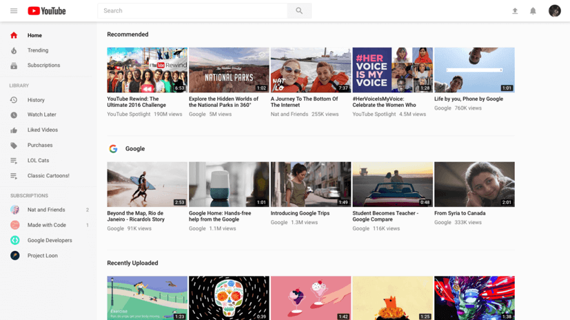
YouTube’s content is designed for easy scanning. Large pictures and simple titles draw attention quickly and entice users to click. There are no long descriptions; rather, “previews” give each video’s highlights, and users can access a video’s full content with one click.
The homepage, shown below, breaks up each category or channel with white-space to prevent overwhelm.
 Source: YouTube.com
The images representing each video are eye-catching but don’t overcrowd the page. The navigation toolbar, located on the left of the page, makes it easy for users to maneuver through the large volume of video content. Outside of the navigation toolbar, the text is limited to the titles and producers of each video.
Because YouTube is the most popular website among Gen Z users, its navigation and scanning patterns shape younger users’ expectations for other websites they visit.
You don’t need to fill your website’s pages with millions of videos to engage Gen Z users. Instead, replicate YouTube’s structure and layout to ensure younger audiences are familiar with your navigation.
One easy way to do this is to design your website according to common scanning patterns. Eye tracking research from the Nielsen Norman Group shows that people scan in an F-shaped pattern, where users usually read across the upper part of the page’s content before scrolling down.
 Source: Nielsen Norman Group
This scanning pattern was first discovered in 2006, so Gen Z website users will have grown up browsing websites designed with this heatmap in mind.
YouTube also has a “sticky” user experience – drawing people to return to the website. Features like auto-play and related content algorithms increase chances that users will stay on the website, making YouTube the immersive, fully digital experience that younger users seek.
Integrate images with text and your website will be Gen-Z-friendly and appeal to users of all ages.
If you want to attract younger users to your website, you can emulate YouTube’s web design by integrating text and images, using white space to break up content, and designing your layout for easy scanning.
2. Offer Engaging Content
A study by marketing company Criteo shows that Gen-Z users stream as much as 23 hours of video content per week – almost a day and a half of waking hours each week. A study by marketing company Criteo shows that Gen-Z users stream as much as 23 hours of video content per week – almost a day and a half of waking hours each week. Share on X This extreme number makes more sense, however, when you examine the way YouTube combines content and “sticky” user experience to keep its users engaged.
YouTube offers Gen-Z a multi-faceted content experience – its diverse offerings range from TV shows to music videos, and even educational content.
This array of content makes YouTube a “one-stop shop” for anything younger users could want or need. Gen-Z users may initially visit for a specific purpose – a “how-to” video or the latest movie trailer – but end up staying longer as other items hold their attention.
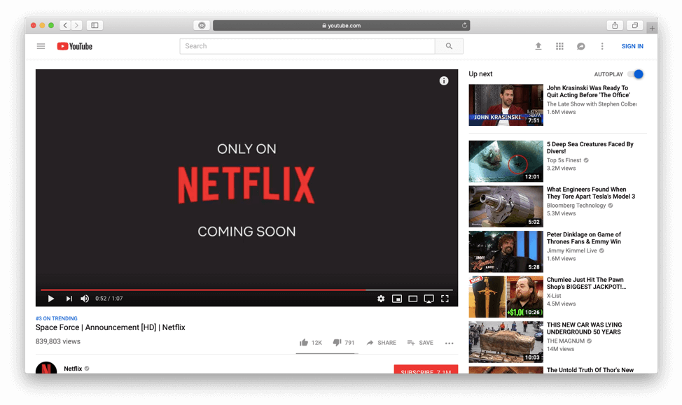
The variety on YouTube increases the likelihood that any given user will find something valuable that matches their search intent. In the image below, you can see the “Up Next” side bar that recommends new content for users based on their viewing history.
 Source: YouTube.com
Older generations differ – 60% of baby boomers prefer long-form content such as a blog or news article. Older generations differ – 60% of baby boomers prefer long-form content such as a blog or news article. Share on X
Businesses can appeal to website users of all ages with their content, and should use strategic web design to keep users on the page.
One way to use content and design to attract multiple age groups is to include video and written blog content together on a page.
SEO firm Moz’s popular Whiteboard Friday blog, for example, presents informative videos as the main source of content with images and the video transcription underneath.
 Source: Moz.com
The video presentations will please younger users looking for immersive content, while the long-form article underneath appeals to older users looking for text-based content.
To engage Gen Z users effectively, businesses should create an engaging content strategy suited to their needs. Once the content is ready, businesses can design with content in mind to optimize the user experience for younger content consumers.
3. Avoid Distracting Pop-Ups
If you want to attract a younger audience to your website, however, it’s best to avoid pop-ups completely. Pop-up windows are popular tools for businesses to drive PDF downloads or email subscriptions.
The Visual Objects survey reveals that these intrusions turn tech-savvy Gen Z users off, with pop-ups labeled as “most frustrating” for 24% of survey respondents in that age group.
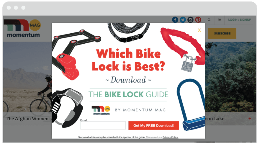
The most common pop-ups, like the ones shown below, often offer discount codes in exchange for an email address.
 Source: JustUno.com
This marketing tool averages just over a 9% conversion rate, according to Sumo.
Older users, such as Gen X and Baby Boomers, are more tolerant of disruptive pop-ups. Baby boomers, for example, appreciate pop-ups that offer discounts. If your goal is to attract younger website users, however, pop-ups are more likely to alienate than convert.
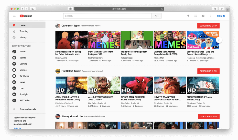
Seek alternatives to pop-ups to convert younger audiences. Instead of implementing a pop-up contact form, give readers the option to subscribe elsewhere on the page. Follow YouTube’s lead and include a colorful call-to-action to attract and convert users.
 Source: YouTube.com
Red “Subscribe” buttons above each topic allow users to opt in on their own terms without having their user experience interrupted. Many videos will also include a call-to-action (CTA) in the video content to drive conversions.
If your website includes video content, avoid disrupting the user experience by disabling auto-play features. Make sure videos are embedded in the page, rather than having them appear as a pop-up.
Gen-Z users want to browse with few interruptions. Limiting pop-ups will keep these younger website users coming back to your website.
YouTube Sets the Best Example for Website UX
Using YouTube as a model, businesses can create a user experience that attracts younger audience to their websites.
For audiences in the Gen Z demographic (18-24), a website’s UX needs to be intuitive, immersive, and non-intrusive in order to attract and retain their already shortened attention spans.
To attract younger website users, businesses should design their website to have a “sticky” UX – combining intuitive layouts with immersive content.
Layouts should follow established scanning patterns and provide a clear navigational structure. White-space breaks up large amounts of content on a page and helps direct attention to visuals and text.
Gen Zers prefer their content to be brief and visual with as little reading as possible. They also want a variety of content that immerses them in the website experience. And they want to enjoy their visit to the site without the annoyance of pop-ups or other disturbances.
The optimal website UX is designed with the target audience in mind. It blends the right amount of style and substance to keep the users engaged and content. If Gen Z users are your target audience, YouTube sets the best example for website UX among the top websites. Web design companies can help you create a high-quality website that will draw this audience to your website.
Related Posts
Kelsey McKeon is a Content Writer at Clutch and Visual Objects. Her content provides actionable tips on how businesses can maximize their working relationships with business services partners.

