One constant in business-to-consumer operations is that you’ll have competitors, and if you don’t, you soon will. Sure, your current customers may stay with you because they know you provide quality customer service, but how do you attract new customers who can choose someone else? Your website is the key to standing out.
There are approximately 1.9 billion websites in the world, yet only around 200 million of them are active at any given time. While only a portion of those are B2C websites, you can see if you want to grab the user’s attention, your website had better be the best it can be.
Here are 11 things that can help you stand out from the competition and turn site visitors into customers.
1. Clear Explanation of Benefits
It might sound obvious, but many websites fail to clearly explain how the company helps consumers. If you have a business, your mission is to solve a problem of some sort. For example, if a bride-to-be needs a wedding dress, you can solve that problem by providing the most varied online selection of wedding dresses available.
2. Get Detailed
One major frustration for many consumers is lack of product descriptions. Shopping online is very different than doing so in person. The consumer can’t touch the product or view it from different angles. However, you can explain the material to them, you can show 360-degree product views and you can give all the details a shopper needs to make an informed decision.

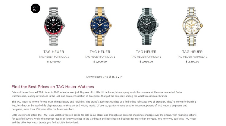
Little Switzerland does an excellent job of separating watches into categories, such as brand, and then going into great detail on what is available on that page. On the product pages, the descriptions are vivid and explain every aspect of the item, as well as offering photos that highlight the features of the product.
3. Add Trust
Site visitors have to trust you if they are going to share their information and buy from you. About 44 percent of your visitors will leave if you have not clearly listed contact information, such as a phone number and email. Be as transparent as possible to add the trust factor. List your policies and share who you are and why you started the business.
4. Create Strong Content
Have you ever visited an e-commerce website and realized they don’t have enough information to help you make an informed decision? Content is a great way to drive traffic to your site and offer added value to your site visitors. Because many e-commerce sites don’t offer content, such as articles or videos, adding this element allows you to stand out from the competition.

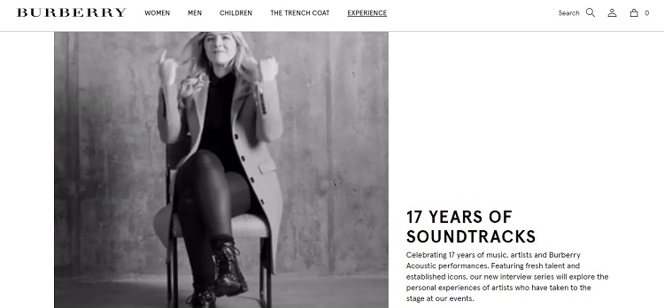
Burberry is known for their trenchcoats in particular, but another way they reach people is by sponsoring music events and sharing the stories behind them. Note the interviews and how each person is wearing something from Burberry, such as a coat.
5. Add Video
Video makes a powerful statement and is a quick way to communicate with your customers. Seventy-three percent of people indicate persuasive video has influenced them to purchase a product or service. Adding a video also helps grab the user’s attention from the minute they land on your page.
6. Use Different Colors
Some types of businesses use similar colors. You’ve likely noticed the deep blues for banking and financial services, which makes them seem established and trustworthy. If the company sells environmentally friendly products, expect to see earthy hues. What if you did something just a bit different? What if your financial services company used red with just a touch of the blue? Anything you can do to stand out from the competition will help identify your brand.

Edward Jones does something really interesting with their landing page. They bring in blue tones with a full background image. Then, they add pops of orange and yellow. That really differentiates them from their competitors and is also eye-catching.
7. Improve Purchasing Process
Another thing you can do that will help you attract more customers than your competitors is to make the purchase process as simple as possible. If there are too many steps, you risk the consumer abandoning the cart and leaving your site for a competitor’s.
8. Write Better CTAs
Your call to action should grab the user’s attention and make them want to take action. The color of your CTA button, the placement on the page and even the words used on the button all have an impact. The best course of action is to try different combinations and conduct A/B testing to see what translates best with your site visitors.

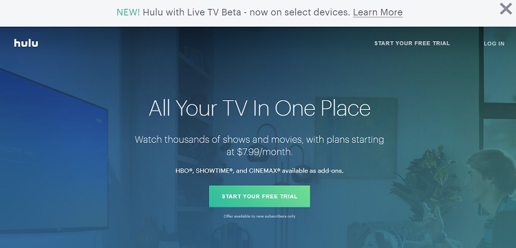
Hulu does a great job with their CTA button. Note how the color contrasts nicely with the background, and the placement is above the fold where the users can easily find it. The text reads, “Start your free trial,” so it is very clear what action the user should take and the benefit of that action. Words such as “free” are also trigger words for users.
9. Check Shipping Costs
Are your shipping costs in line with what your competitors offer? If not, figure out how to reduce your costs in some way. High shipping costs will cause users to bounce away from your checkout process. Offer free shipping for orders over a certain amount.
10. Make Your Site Faster
A one-second delay in how fast your site loads equals a 7 percent loss in conversion rate, and a site that takes more than three seconds to load risks losing about 40 percent of its site visitors. There is an excellent reason sites such as Amazon put so much focus on being the fastest-loading sites on the Internet. In an age of ever-shortening attention spans, fast delivery equals fewer bounces.
11. Grab Interest
It might sound simplistic, but it’s important to look at your site through the eyes of your site visitor. You must grab their interest from the minute they land on your page and keep it. Many factors play into keeping the user engaged, including catchy headlines, beautiful images and interesting content.
Keep Improving Your Site
Even if your site is fairly successful, you should never stop improving it and adding new features to help you stand out from the crowd. Anything you can do to get people to come to your site and keep them coming back gives you an edge over your competitors. After all, you want people on your site and not someone else’s, so all the extra effort is well worth the time and investment to get and keep them there.
Related Posts
Lexie is a designer and typography enthusiast. She enjoys writing HTML code and creating new styles guides. In her spare time, she works on her design blog, Design Roast.


[…] What Your B2C Website Needs to Stand out from the Competitors […]