In today’s digitally cluttered world, there’s a massive opportunity for brands to stand out visually. So why are so few seizing the opportunity and designing to be different?

Seth Godin famously said:
“Playing it safe. Following the rules. They seem like the best ways to avoid failure. Alas, that pattern is awfully dangerous. In a crowded marketplace, fitting in is failing. In a busy marketplace, not standing out is the same as being invisible.”
Subscribe to Read the Largest Marketing Live Book =>
While Seth wasn’t necessarily talking about purely design, the sentiment still holds very true. With the onslaught of new product and service launches showing no sign of slowing down, there are naturally less and less opportunities to bring something truly unique to market. Competition in most sectors is increasing exponentially. Many start-ups launch to try and solve problems and or meet needs that weren’t previously being met. But whilst the products are great that’s often where creativity seems to stop.
With that sobering thought in mind, I’m here to argue that you should be taking as many risks with your design and branding as you do with your product. Let’s take Seth at face value!
It’s not a surprise that the brands that stand out, in turn create value, trust and loyalty. Design and user experience for a brand in the digital space is the visual and interactive manifestation of your brand, so let’s start thinking more about how we can stand out.
Let’s take a step back and think, what is the problem?
If the job of the brand is to differentiate a product or service and communicate that visually, verbally and through the experience, then logically the design elements of that brand, including the UX and UI, should differentiate too.
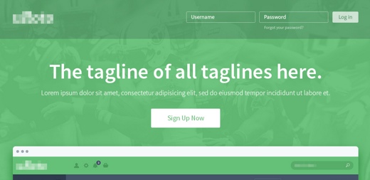
So why am I seeing virtually all new websites with the same layout, the same icons, the same feel. Surely these brands all have something unique to offer? Otherwise, what’s the point?
Is Technology in Design to Blame?
I know we have a huge amount to thank technology for, my own business DVO is completely dependent on it.
Before the advent of technology, design was a laborious exercise, but it was a craft, a real skill. Then technology exploded. At first it was still something you needed a design degree to master and the old skills and knowledge still commanded a premium and a huge amount of respect. But as the technology has become more accessible it requires less and less skill to use. From infographic makers to website templates, anyone can design something these days and in a way, that’s half the problem, as it’s meant a general devaluing of a skill that can ultimately make such a huge difference.
What most software fails to give you however is a grounding in design principles. I’m yet to read a design book that doesn’t advocate picking up a pencil and working up an idea before cracking on with visuals. However this advice and the process of moving from a concept to a finished piece isn’t something you tend to see touted on an online tool. But it’s an essential step whether designing a logo, poster, website or product. Crafting the visuals won’t turn a bad idea into a good one it will just make it more flashy.
I often approach creative projects with a couple of quotes in mind, the first is actually a bit of copy from an old Microsoft ad:
“The man that invented the computer didn’t come up with the idea sitting in front of a computer”
The other is from Bill Bernbach
“Rules are what the artist breaks; the memorable never emerged from a formula.”
I keep this in my mind through the process as they keep me focused on developing an idea.
Design Matters and Good Design Sells
If I had a penny for every time I heard “make it look like Apple” I’d be a very rich man. I believe that no one should ever aspire to be Apple, because Apple is already Apple. But there are some great lessons we can learn from Apple, particularly how design is integral to how a brand positions themselves.
I’m not going to write an essay on Apple's philosophy so here’s two good articles worth reading:
Visual Marketing and Creative Are Where Battles Can Be Fought and Won
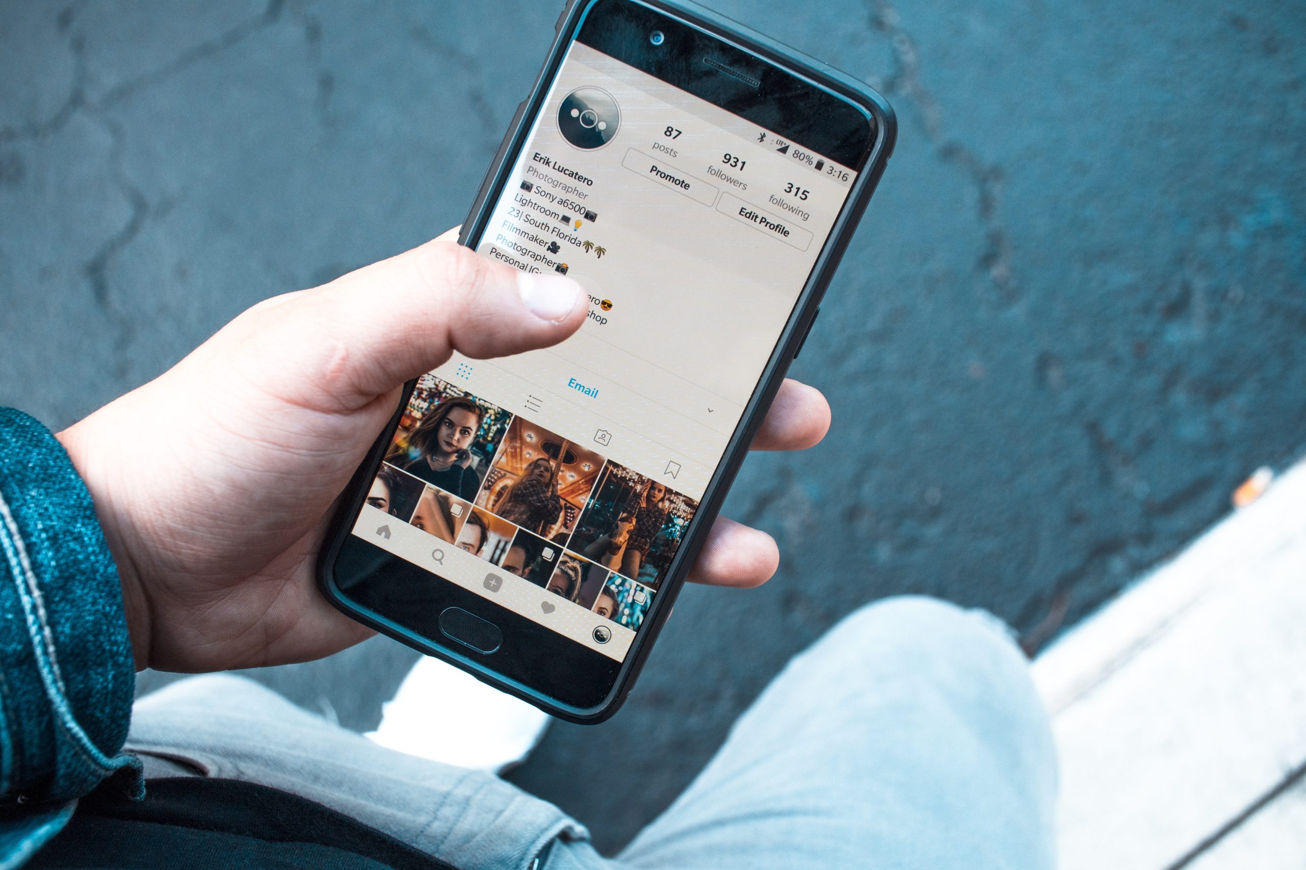
Human beings are visual animals. It’s how we connect with each other, it’s how we communicate (body language accounts for 55% of communication between people, tone of voice 38% and the actual words only 7%) and it is how we prefer to assimilate information. They say a picture is worth a thousand words and just a quick look at engagement levels of photos, infographics, videos and even memes tells you about how we interact in the digital space.
As I mentioned earlier, it’s pretty hard to launch an entirely new and unique business nowadays. The micro-positioning of brands is something that is going to become more and more important in the coming years. But for now, with the lack of strong, vibrant, compelling and brave creative we are seeing across so many sectors, there’s a real chance for brands to be able to use visual marketing to differentiate themselves and capture customers’ interest.
The Internet Is a Visual Medium
Which, if like me, you were around before the Internet was a part of every single aspect of your life, is hard to wrap your head around. When the Internet first took off, it looked very different. Millennials can’t believe what they’re seeing when shown old screenshots of early pages. Images? Pah, who needs them? The Internet is where reams and reams of very dry, very boring data can be stored, so anyone can find a small piece of not very useful information which took them over an hour to access. Brilliant!
Thankfully, things started to change pretty quickly. Then social media came along, then camera phones, then smart phones and bam! You can’t move on the Internet without pictures of someone’s lunch and an ironic meme about some or other politician.
What the Internet has done is put power back into your average Joe’s hands. And taken some of the mystique (and cost) out of creating online spaces. Anyone can build a website now, literally anyone. And that’s great and that’s right. But when it comes to business, brands can’t be so complacent. This isn’t your holiday blog we’re talking about here, this is probably the first place every single one of your potential customers is going to head to, to engage with you. So, don’t you think that’s worth some kind expertise, specialist talent to translate your vision in a creative and visually appealing way.
What’s the Solution?
Start with an idea.
At this point I will take it as given that you have some idea of your customers, a set of brand guidelines covering your colors, fonts, personality and values and some idea of your competitors and what they’re up to.
So it’s time to get out the:
Start sketching out some ideas, see if they work. Do they convey the experience you want the user to have, does the UX balance out with the UI. Too much of one and not enough of the other and you’ll have either a very visually appealing site that’s not intuitive or a site with great UX that looks terrible.
Get some friends, colleagues or passers by in on the act.
Test your ideas out, try a simple exercise it takes about 2 hours.
Draw up your ideas whether you think they’re good or bad. (1 hour)
Share them with your peers. (30 mins of feedback)
Work up any that resonate or repeat.
Open your computer.
Once you’ve got some ideas you think merit more work it’s time to make them look nice.
Build a mock-up.
If you can afford to spend some time developing a mock-up or alpha test site, get people to use it, see how they interact. Also see how they feel and try to understand how they emotionally connect with your design. Human beings are not 100% rational or 100% emotional, what we do know is that decision making is nearly always emotionally driven.
Read this, it will give you some amazing insight into choice and decision making:
Above all try to avoid the formulaic.
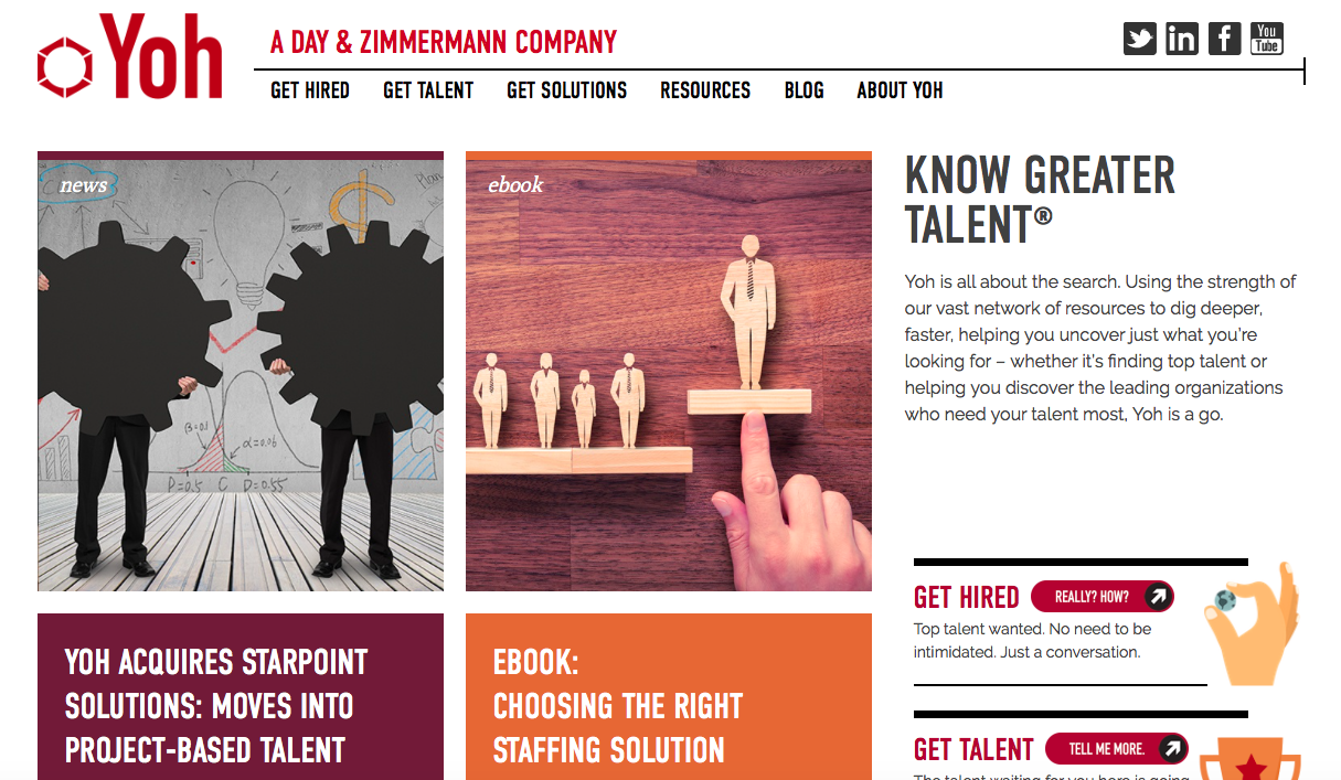
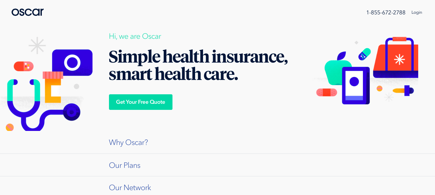
And take a leaf out of these guys books:
These guys are a recruitment firm but their website is anything but. They’ve stepped away from conservative images and stuffy copy and made it fun to explore and learn about their company
These guys use visuals and short bold copy to get their message across. What’s striking is that you instantly get a feel for their personality. Not something the insurance sector is renowned for.
All that’s left to say is good luck, think differently and stand out.
Subscribe to Read the Largest Marketing Live Book =>

Ben is M.D. of DVO a digitally-led communications agency. DVO is obsessed with growing revenue for clients and building their brands in the digitally connected world. An advocate of strategies that leverage modern consumer behaviour, Ben’s expertise lies at the intersection of strategy, creative and technology. With a particular interest in developing content marketing, integrated campaigns and applying emotional insights in a digital context to drive success.