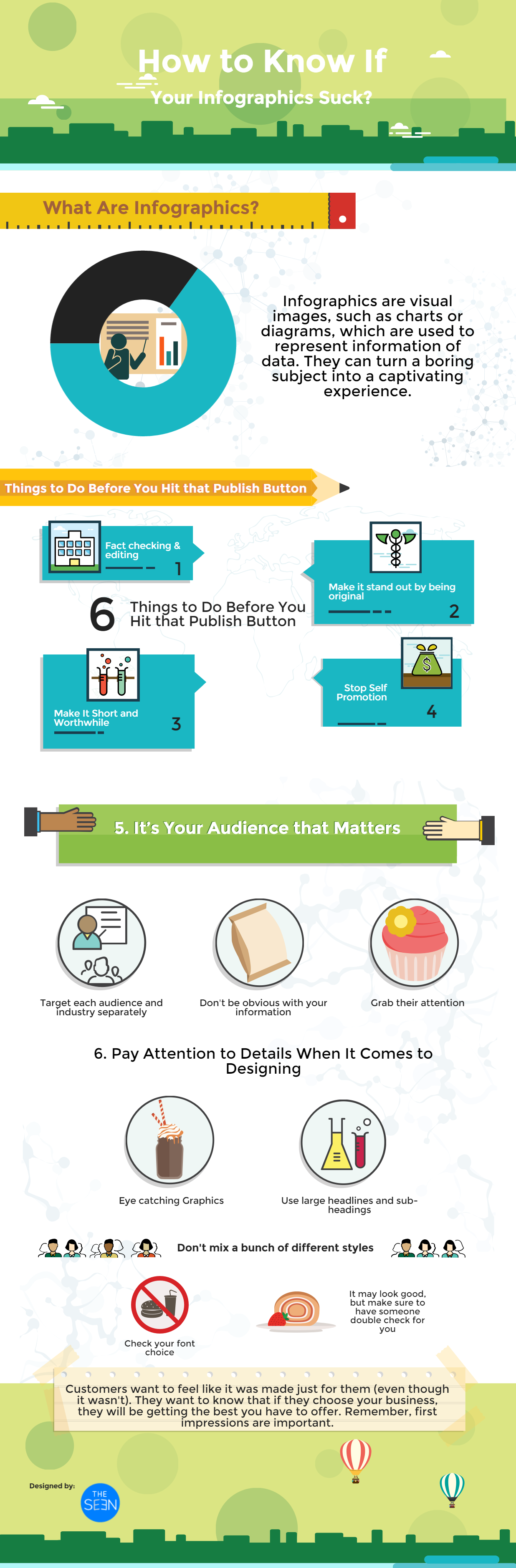
Infographics are visual images, such as charts or diagrams, which are used to represent information of data. They can turn a boring subject into a captivating experience. Visually, they should be engaging, contain a subject matter that is appealing to your audience and be supported by other engaging content. The best ones are entertaining.
Unfortunately, sometimes you can try too hard with your Infographics.
Here are 6 tips you should follow before you hit that “Publish” button to make sure your Infographics don’t suck.
![How to Know If Your Infographics Suck [#ActionableTips]](https://visualcontenting.com/wp-content/uploads/2015/06/2.png)
Fact Checking
Some of the easy things to do to make your Infographics bad can be simple. One of the biggest mistakes is not fact checking and editing. Make sure to have your work checked over and over again for misspellings and wrong word usages. Your potential customers can see this data and make their decision whether or not they should trust the service you offer.
Make It Stand out
Don't make your Infographics like everyone else. Be original. Choose your color scheme with thought. You want your colors to pop but you also want it to be a good color combination.
Stop Self Promotion
Don't spend too much time talking about your services or product. Believe me; you can scare your audiences off this way.
Make It Short and Worthwhile
You don't want your Infographics to be too long. You don't want it to be too busy, with so much happening at the same time because it draws a person’s focus from where you want it to be.
Don't spend a lot of time trying to explain it. Make it short and sweet and to the point. Make sure when you have something to say you make it interesting and understandable. Don’t confuse your audience.
It’s Your Audience that Matters
Try to target each audience and industry separately. If your business is marketed for multiple industries, try to have something specific for each.
Make sure your audiences don't already know what you are going to say. Don't be too obvious with your information.
Try using unusual tactics to explain things and grab their attention.
Pay Attention to Details When It Comes to Designing
For your graphics, make sure you don't skimp. You want graphics but not too much. It should be eye catching and somewhat subtle. You want to grab your customers’ attention but in a tacky way. Make sure your headline grabs attention.
Don't mix a bunch of different styles. You don't want to risk throwing the potential customers off.
Check your font choice. You may think it looks good but you should still have someone else look it over.
Use large sub-headings.
Last But Not Least
Customers don't want to feel like it is jumping out to get them all at the same time, they want to notice the important things. That said, use sub-headings to grab their attention. If they find it interesting, they’ll want to know more.
Customers also want to feel like it was made just for them (even though it wasn't). Most of all, they want to know that if they choose your business, they will be getting the best you have to offer.
Remember, first impressions are important.


Every brand has its own story that is waiting to be told. Storytelling technique combined with creative design is what you need to effectively tell this story.
It’s what we do at Visual Contenting.
We specialize ourselves in helping people and brands visually tell their stories to the right target audience, with the right messages and at the right time.
It’s time to TELL YOUR STORIES WITH PICTURES!!!


Hey, thanks for sharing so much helpful information with us.