It's no secret that a variety of conscious and unconscious factors combine to make people decide to buy things or hold off on their planned purchases. Visual elements have a lot to do with influencing purchases. Sometimes, relatively small factors make impressively big differences in boosting sales. Here are five examples of science-backed design tips for companies to consider implementing to help sales levels rise.
1. Visual Security Cues Shown During the Checkout Process

A trust seal is a small graphic — often placed in the footer of a page — indicating a legitimate business, a secure site or another aspect to give peace of mind. The Baymard Institute compiled a series of internal studies to better understand the factors that inspired or eroded consumer confidence.
Firstly, research conducted by the organization in 2016 indicated that a site looking "visually secure" made a person more likely to trust it. Moreover, the data revealed that the more well-known brands did not have to emphasize such aspects as much. The assumption was that the name recognition caused a person to trust the site more, even if they did not notice visual security cues.
Users responded well when brands used different styles for the credit card sections of their checkout pages, such as choosing a different background color or adding a padlock icon. Moreover, Baymard Institute's research about visual security this year found that 35.4% of users trusted a site most if it had a Norton security seal.
Furthermore, the researchers concluded that placing one or two seal graphics within the defined credit card area was most effective for making a person feel ready to give business to a site. Interestingly, though, Baymard Institute's researchers determined that even using a fake seal on a checkout page had positive outcomes for increased trust. That suggests conditioning makes people associate seals with security, but many won't take the time to determine if the graphic is genuine.
The findings of Baymard Institute's studies also showed how site bugs, such as text inputted into a field appearing strangely, could give a user the impression they're on a hacked site. Thus, if brands take the time to implement some visual security aspects, they should also verify that nothing about the checkout page or process gives people cause for concern.
Recommended: 8 Ways to Provide a Better E-Commerce Experience in 2020
2. High-Quality Product Images
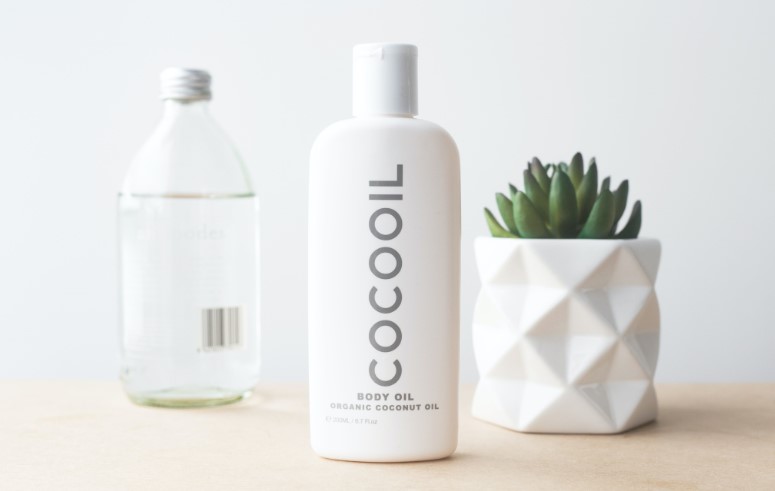
Product images are crucial for online shopping because people cannot touch a product before purchasing it. For example, a picture of an item of clothing can help a shopper determine its cut, texture and color. If the images show a product from several angles, people can gain more accurate perspectives of the product. That's especially true if it's something that looks different depending on a person's viewpoint, such as a couch, a tent or an outdoor grill.
A 2017 study from Splashpoint examined to what extent people depend on images when shopping online. The results showed that 47% ranked high-quality pictures as most influential for helping them decide whether to buy. Moreover, half of the respondents wanted to see at least three to five product images, showing the item from the front, back and side. Then, more than a quarter (26.5%) preferred to see more than six, including pictures giving close-up and 360-degree views.
Snapshots that show the item on a model also drive purchases, the data showed. More than half of people (51.7%) said seeing a person showing off the merchandise may increase their likelihood of buying it.
These findings emphasize that brands should not haphazardly shoot pictures and upload them to websites. Instead, the ideal approach is to think carefully about what people would most like to see, plus how pictures could help remove any doubts that could prevent purchases.
Company representatives should also pay attention to any comments people make about the images. For example, a business selling a baby stroller might see several individuals saying things like, "I wish the pictures showed what it looks like when folded. Then I could get a better idea of if it'd fit in my trunk." Marketers can then respond accordingly by uploading new photos to meet those expressed customer needs.
Recommended: 5 CRO Hacks that Will Boost Your e-Commerce Sales
3. Visual Media Supporting Sensory Experiences

A wide variety of things — such as store displays and pricing and packaging — can drive brick-and-mortar purchases. Additionally, a 2019 study from Mood Media showed how visual imagery supports sensory experiences that keep people coming back. The research focused on physical stores, but brands can apply some of the takeaways to enhance online sales, too.
The report indicated that 58% of shoppers around the world said engaging imagery positively impacted their shopping trips.58% of shoppers around the world said engaging imagery positively impacted their shopping trips Share on X Then, 43% of respondents in the U.S. liked seeing digital screens while shopping. The preference for them was even more prevalent in 18-24-year-olds and people aged 25-34, with 62% and 63%, respectively, liking them.
Digital marketers could capitalize on those findings by recreating the effect of digital screens on a website. For example, video banners and animated graphics could both make a person want to linger on a site and find out more about its offerings, thereby stimulating purchases.
Mood Media also examined the effects of scent and sound on people's willingness to purchase. The technology doesn't yet exist for online marketers to introduce scents to people shopping online. However, sound effects can improve the user experience at websites and help set the mood. For example, a site selling outdoor gear might play an ambient soundtrack of chirping crickets or crashing waves, appealing to people who love nature.
If that website also had video panes showing stunning scenery or people enjoying the natural world to the fullest, consumers could feel inspired to make purchases that give them opportunities to follow suit. Companies never want to annoy shoppers with the sensory content, though. The smartest way to go about using it is to give people the option to toggle visuals and sound effects on and off as desired.
4. Descriptive Logos
Another one of the visual design trends worth noting relates to descriptive logos. They have visual or textual design elements representing the product or service sold. For example, Burger King's logo features the brand name placed between buns, while the first word in the name leaves no doubt about the kind of sandwiches sold. Conversely, the McDonald's logo — famous as it is — is the non-descriptive type because nothing about it gives product clues.
Harvard Business Review conducted studies of nearly 600 logos to figure out which types worked best for bringing about specific desired outcomes. It found that about 60% of companies had non-descriptive logos, while the remaining 40% went with descriptive ones. Also, one of the science-backed design tips gleaned from the study was that businesses should consider picking descriptive logos to positively impact sales and more.
The results showed that descriptive logos:
- Increased net sales
- Caused an uptick in consumer willingness to buy
- Encouraged people to see brands as more authentic
- Impacted consumers' brand evaluations in favorable ways
The researchers also clarified that the logo-based effects depended on people's overall familiarity with the company. For example, brand equity went up for both well-known and less-familiar enterprises with descriptive logos. The total amount of brand equity increased for the better-established names, however.
The team pointed out, too, that descriptive logos are not the best choices in all causes. For example, businesses that bring to mind unpleasant or sad things — like brands selling bug repellent or operating funeral homes — may find it's best to stick with non-descriptive logos. Furthermore, a company that hopes to eventually span beyond one primary product type or category should steer clear of descriptive logos to avoid giving people overly narrow perceptions.
5. Star Ratings

Star ratings offer people a clear, visual system for setting expectations. Whether a person wants to know about the quality of a newly released movie or the overall experience of eating at a restaurant, star ratings help them reach accurate conclusions. Reviews with stars associated with them also aid individuals in making decisions when buying online, research from Field Agent shows.
The company conducted 14 studies across February and March 2018 to learn about consumers' e-commerce preferences, then combined the results into a comprehensive report. The insights closely connected to the topic at hand relate to the product listing page (PLP) and the product detail page (PDP). Three-quarters of the respondents said they filtered the content on the PLP by star ratings or reviews at least some of the time.
Then, concerning the content on a PDP, 64% of the people in the study considered star ratings extremely or very influential to their purchasing decisions. Brands looking for more science-backed design tips should also combine star ratings with other aspects that let shoppers gauge whether a product or service warrants their money.
For example, 83% of people said product images proved extremely or very influential on what they purchased. 83% of people said product images proved extremely or very influential on what they purchased Share on X Then, three-quarters of individuals reported that about customer reviews and 45% did so regarding comparison charts. These findings strongly suggest that people take numerous things into account when shopping, and they appreciate it when the content provided tells them what to expect and gets them informed.
People universally understand star ratings, which is one compelling reason to add them to a product listing. Companies could get even better results by providing supplemental visual content, however. For example, a brand might sell various styles of laptop cases and publish charts to help people understand the differences between them. If one row showed the number of 4 and 5-star reviews for each type, a person who finds star ratings helpful could feel more prepared to buy.
Visual Design Trends to Improve Efforts
The visual design features covered here don't guarantee success, but science shows they're worth exploring. Companies that decide to give them a try should track associated sales metrics to monitor how statistics change over time. They should also remain mindful that most changes don't cause immediate effects. Seeing the full extent of benefits could take weeks or months, but patience should pay off.
Related Posts
Kayla Matthews is a MarTech journalist and writer, whose work has been featured on Marketing Dive, Contently, Outbrain and Convince and Convert. To read more posts from Kayla, please visit her personal tech blog, Productivity Bytes.



[…] Recommended: 5 Visual Design Trends Proven to Increase Sales […]