Understanding the psychology of typography in designing also relates to the choice of typeface, color scheme, and layout of some design.
Typographers usually associate with marketing professionals, content writers, and graphic designers to create products for the physical world like product packaging, billboards, or road signs.
The expansion of typography came with the development of the internet. The net is the most potent graphical medium, and it made typography increasingly crucial to any marketing and advertising strategy.
The internet made the world highly visual, and the printed word has never been more appreciated or shown up in such abundant visual diversity as it is today. There are thousands of different fonts to choose from.
The Importance of Typography
Typography can be very attention-grabbing, and this is the main reason why so many businesses use it to convey certain feelings and emotions.
The use of the right kind of typeface affects the reader's willingness to continue reading, thereby increasing their interest level and focus.
Businesses use typography to enhance their presentations to be more visually appealing to facilitate audience engagement and communication. On the other hand, typography matters a lot in content writing.
Different font types, colors, and sizes are used to establish different content functions and importance, while typefaces make content more readable by including bullet points, paragraphs, and headers.
In graphic design, typography helps create simplicity, continuity, and harmony, allowing professionals, artists, and businesses to maintain communication with their partners and customers, and build brand recognition.
Typography matters because:
- It's a powerful communication medium
- It's attention-grabbing
- It keeps audiences focused
- It helps brands convey certain emotions and mood
- It helps prioritize the information
- It helps create harmony
- It's professional
- It builds brand recognition
The Psychology of Typography in Design
The psychology of typography in design comprises five key elements – fonts, lines, shapes, colors, and structure.
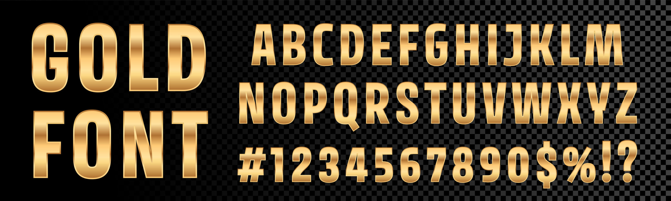
1. Fonts
There are six different font styles in typography, each having its psychology:
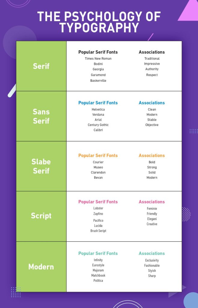
- Serif font – classic in nature, promotes feelings of heritage and class. Businesses use it to show that they are well-established.
This font carries feelings of respectability, professionalism, and trust. That’s why so many brands use it to build their identities, brand awareness, and trustworthiness.
- Slab serif font – frequently associated with attitude, solidity, and confidence. It is used by modern businesses looking to expand on the market and introduce new ideas, services, or products. This font helps brands establish feelings of trust, confidence, and value with their target audiences.
- Sans serif font – Considered to be engaging, modern, and clean. Brands use this font type to demonstrate their professional, simple, and straightforward attitude. It helps brands reach their target audience and establish a meaningful relationship.
In regards to creative design services and psychology of typography in designing, this font can help brands convey messages of sensibility and honesty in an effective yet simple way.
- Script font – aimed at provoking ideas of creativity, elegance, and femininity, this font type feels more personal. Brands use it to gain customer affinity, inspire emotion and convey experience, history, and a certain feeling.
- Modern font – designed to be legible and straightforward, this font conveys style, intelligence, and exclusivity. It helps companies to showcase their brand in the best way possible to grab attention.
- Display and decorative fonts – highly customizable, these are unique fonts that allow companies to add personality to their brand. It helps companies establish the right connection with their target audience to get the desired emotional response.
2. Lines
Some fonts such as Georgia, Baskerville, or Times New Roman have decorative lines at the end of characters. These decorative lines are associated with respectability, reliability, authority, and tradition.
Some fonts don't have decorative lines, and they are generally considered to be stable, objective, modern, and clean, while other handwriting-based fonts convey a sense of friendliness, creativity, and elegance.
Lines help brands appear expressive, strong, bold, intelligent, progressive, stylish, and chic. The truth is, lines can make your logo resonate with your target audience if appropriately used.
3. Shapes
If the main idea of your business is creating user-friendly interfaces, understanding the perception that people have for various shapes will be beneficial in getting your user interface and brand image right.
Any visual object can be analyzed through shapes as they have a pervasive impact on people's behavior and consciousness.
Shapes can be used to study and define the mental condition or personality:
- Squares and rectangles – reliability, security, courage, strength, discipline, authority, trust
- Triangles – stability, balance, danger, risk, excitement, motion, direction, energy, dynamics
- Circles, ovals, and ellipses – mystery, magic, eternity, female, universe
- Spirals – knowledge, information, creativity, life, growth, calmness, intelligence, eternity
4. Color
Typography and matching colors are the two most essential, and strongest elements of an attention-grabbing, convincing design. Colors are proven to impact consumers' psychology.
Humans are visual beings, and the right combination of fonts and colors helps achieve specific neuro-associations to make subtle influences most effectively.
Businesses use colors to add value to their brand message, image, and reputation to build trust and loyalty. Many studies have proven that different colors have different emotions and moods associated with them.
Recommended: Various Uses of Color in Web Design
That's why brands use different color combinations to reach their audiences.
5. Structure
The structure is vital to your marketing efforts. If you choose the right font features to structure your posters, banners, webpages, and documents, you can make them more attractive, memorable, recognizable, and attention-grabbing.
You can keep your readers more engaged by providing the right font.
Whether it's script, display, serif, modern, or sans serif, your selection needs to match your message. For example, the script is used to convey elegance and sophistication while display makes your logo more recognizable and bolder.
Serif is used to emphasize respect and simplicity, stability, and reliability, while modern font excels at capturing the consumer's attention.
Conclusion
Businesses with a recognizable, memorable, simple, and attention-grabbing logo design are better at conveying their brand messages.
That's what the psychology of typography in designing is all about. Using the right font style, shape or color can help to establish a connection with the consumers. This will add more value to your business.
Companies need creative design services to create memorable and attention-grabbing logos that convey their unique brand identities. The point of a brand logo is to make your business stand out from the rest.
Since we live in a visual world, typography helps improve your brand appearance, awareness, and increase brand recognition. Every style conveys a different personality. That's why it's incredibly important to understand the psychology of typography in designing.
This knowledge will give you the means to build a strong brand. You’ll establish a relationship with your target audience which will be based on trust, credibility, and loyalty.

Erica has been an avid blogger for 5 years, with particular interests in creative design – graphic design, illustration, etc. Today she is an expert on the subject and over the years she has consistently contributed articles to designing publications. Presently, she is associated with Artwork Adobe (AWA) – a creative design company. For more visit: https://www.artworkabode.com/