Every year, it seems as though new trends emerge in an effort to increase conversions for website owners. One of the latest is sticky bars that follow the user as they navigate down the page. This keeps pertinent information close by at all times. CTAs within the bars can increase conversions by keeping the option to subscribe or buy a mere fraction of an inch away.
An average conversion rate for an e-commerce store is 2.63% in the United States, but globally it rises slightly to 2.86%. An average conversion rate for an e-commerce store is 2.63% in the United States, but globally it rises slightly to 2.86%. Share on X Even though you might drive thousands of visitors to your site, only a fraction of them will convert to customers or leads. What if you could improve your numbers by even 1%? You'd see a gradual increase in profits.
Fortunately, there are many ways of increasing conversions — and sticky bars are one effective tool for doing so. However, you must keep in mind some specific features to ensure they are successful for you. Here are some things to consider.
1. Push Yourself on the User
Even though there is a fine line between obnoxious and insistent, sometimes it pays to push yourself on the user a bit. A sticky bar accomplishes this by taking the most important element on your page that has the biggest chance of converting users and keeping it in their eye-line. Perhaps you include a video to describe something about your product, or maybe you offer a free book if they click on the link.
Noah Matsell offers the site visitor a chance to view a video when they land on the page. If you scroll down without seeing it, the clip becomes sticky and follows you down the page, playing to the side in a small box. Since video has high conversion rates, this is an effective technique.
2. Improve Navigation
One of the most common uses of the sticky bar is turning navigation into a feature that follows the user down the page. This puts the main categories available to the user any time they need them. Instead of hitting Ctrl/Home or scrolling to the top or bottom of the page, the visitor simply clicks on the navigation links already there.
3. Highlight Calls to Action (CTAs)
Navigation is just one thing you can place in your sticky bar. Another option is adding a CTA button that draws users to take action. Designers often wonder about the best placement for a CTA. Should it go above the fold? Perhaps below is a better option. Some even consider the sidebars as an option. However, when you place the CTA within the sticky nav, it is everywhere — even at the bottom of the page.
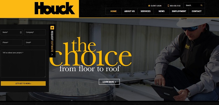
Houck does an excellent job of placing its CTA — which reads "Request an Estimate" — to the left side of the screen and letting it subtly follow the user down the page. The sticky bar isn't intrusive. However, the technique is effective because anyone interested in services can request a quote easily at any time.
4. Make Mobile Browsing Simple
This year, mobile phone internet usage hit 63.4% and has been growing steadily for several years. This year, mobile phone internet usage hit 63.4% and has been growing steadily for several years. Share on X Make sure any sticky elements you add to your website are friendly to mobile devices. If they're not, consider removing them. The last thing you want is to increase conversions on desktops and reduce them on smartphones because of a bulky bar that obscures the user's vision.
5. Utilize Motion Graphics
Another option with a sticky bar is to utilize motion graphics to draw the user's eye. You can do this through your logo, by turning one of the links into flashing text or any number of other options. The sky really is the limit when it comes to motion graphics, but when used sparingly, animation adds interest and draws attention. It also sets your site apart from others.
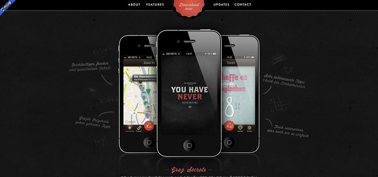
Graz Secrets is an app, but its website grabs attention with a circular CTA smack in the middle of the sticky nav bar. The CTA rotates as though it's a wheel spinning. Combine the motion with the pop of color when the rest of the page is neutral, and you have an irresistible mix.
6. Improve Long Pages
Longer pages seem to be the norm these days, especially when it comes to providing content that is more in-depth and covers all aspects of a topic. On mobile devices, in particular, the incessant scrolling may take its toll. You want the options for navigation or action right there so the user doesn't then have to keep scrolling on their small screen.
Even for those who view your site via a desktop, a longer page can make it difficult to find what the user needs. Keep the focus where you want it with a sticky bar.
Are Sticky Bars Right for Your Website?
Only you can tell if a sticky bar works with your particular audience or not. One of the best measures is installing one and then conducting some split tests to see how your typical user responds. You may need to tweak your bar or lose it altogether to get the results you're after. You won't know how the change impacts your conversion rates until you test things out, and that's well worth the effort.
Related Posts
![The Future of Web Design and Front-End: Emerging Technologies]()
The Future of Web Design and Front-End: Emerging Technologies
Creative and Design![The Importance of User Experience (UX) in Web Development]()
The Importance of User Experience (UX) in Web Development
Creative and Design![Website Design Tips That Generate More Leads]()
10 Creative Tips to Design a Website that Generates More Leads
Creative and Design![The Buyer’s Journey - How to Reach Your Audience at Every Stage]()
The Buyer’s Journey - How to Reach Your Audience at Every Stage
Business Advice


Lexie is a designer and typography enthusiast. She enjoys writing HTML code and creating new styles guides. In her spare time, she works on her design blog, Design Roast.