A company tagline helps define your personality as a brand and gives the consumer a glimpse of what you do. A catchy saying is an excellent way to stand out and grab user attention.
There are nearly 30 million small business in the United States, which means you're clamoring for attention in a pool of other companies no matter what industry you're in. Factor in global businesses, and you can see how it becomes even harder to make a name for yourself. Using a tagline is just one way of increasing brand recognition and defining your image.
However, knowing where to use your tagline isn't always easy. Do you use it every time, or only sometimes? When you use it in print, where do you place it? What about website placement? Fortunately, there are some guidelines to help you know the best position for your tagline to have maximum impact.
1. Feature Your Tagline
If your tagline clearly defines your brand, featuring it in big, bold typography makes it clear what advantage users gain when doing business with you. On a website, place it above the fold in the largest, boldest typography in your font hierarchy. You can even make your tagline larger than your business name or logo. This approach does put the focus on the tagline first, but if you have a powerful enough tag, users will still remember you.
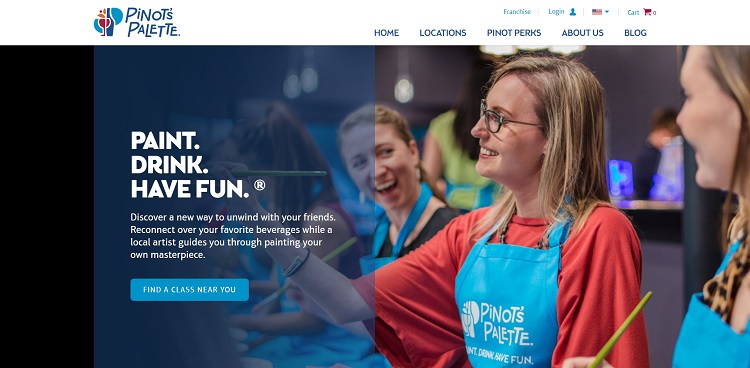
Pinot's Palette is a paint-and-sip class business. Their tagline is "Paint. Drink. Have Fun." They couldn't be more precise about what happens in their classes. Because the tagline so clearly defines what they do, they place it over the hero image in large letters. The logo is smaller than the tagline, which emphasizes what they do rather than who they are. It's highly effective at drawing in users.
2. Place on Printed Bags
If you have an offline store or you hand out promotional bags at an event, add your tagline to your bags. Not only does this clarify to your customers what you offer as a brand, but anyone who passes them sees the bag as well. Promotional bags at an event are an outstanding advertisement for your brand. Place the logo and tagline near the center of the bag. If you place it too low and the bag becomes overstuffed, the letters might become distorted.
3. Under Your Logo
A traditional location for your tagline is just under your logo in the upper left corner of each page of your website. Users expect the logo and tagline to appear here and may even look for it to acclimate themselves to the page and learn a bit more about you at a glance.
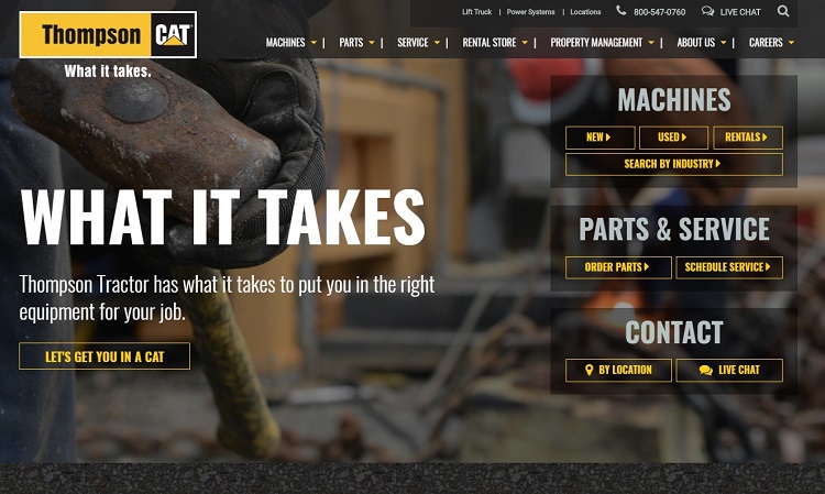
Thompson Tractor Company places the tagline of "What It Takes" right under their logo. They also repeat the tag further down the page and expand on it a bit to define what they do. Highlighting the tagline twice emphasizes the words and impresses them on the viewer so they are more likely to remember them.
Recommended: How to Protect Your Brand Design in 2019
4. Tell the Story Behind Your Tagline
Users relate to brands that tell stories, so explain your tagline and the history behind it. Of course, anytime you connect with users on an emotional level and share something no one else knows, you also need to highlight the tagline again. Soul Cycle does an exemplary job of this on their website. They use action words for their tags, so they list in three columns, "Take Your Journey," "Change Your Body" and "Find Your Soul." Then, under each tagline portion, they go into an explanation about how that particular phrase relates to their business mission.
5. Highlight on Your About Page
You should also feature your tagline prominently on your About page, because nothing defines your business quite as well as a short phrase you've reduced to a few impactful words. You can also further explain why you chose the tagline you did, which helps users understand your brand and connect with you. Once users understand your goals, they may trust you more or at least feel confident in knowing your business is there long-term.
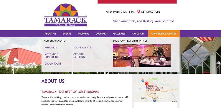
Tamarack features folk art from craftspeople in Appalachia. Their tagline is "The Best of West Virginia." They use their tag right under their logo, but also on their About page. Just under the name of the page, they list "Tamarack: The Best of West Virginia." They then go on to explain they feature artisan products, food and experience for visitors.
Recommended: Crafting a Perfect About Me Page
6. Lay Over an Image
Another technique which works well is laying your tagline over a photo. This approach works for websites, social media, print ads and more. The image, of course, must be highly relevant to your tagline and highlight your purpose in some way. For example, if you sell energy drinks and your motto is "Energy to Get Through It," you'd show an image of an athlete making intense effort to win a race, run a pass or some other feat. The tagline should almost blend into the image, but have enough contrast to be readable.
Promote Your Brand's Benefits
Your tagline tells and sells your brand to consumers, so make sure it shows off the benefits of your brand. That means the placement must capture the user's attention without distracting them from the purpose of your page. If you're unsure if your positioning works as well as you'd like, conduct some split testing and try out different options. You spent a lot of time coming up with the perfect phrase, so make sure you share it with the world.
Related Posts
Lexie is a designer and typography enthusiast. She enjoys writing HTML code and creating new styles guides. In her spare time, she works on her design blog, Design Roast.
