Sliders are one of those website features you either love or hate. There are many different schools of thought on whether it's worthwhile to implement sliders. Some experts say never use them, while others say the feature still serves a useful purpose.
Unfortunately, the most recent tests on sliders date back to 2013, but the issue proved divisive even then. The study tested carousels and found the first image only got a 1 percent clickthrough rate, and subsequent images nothing at all.
Since that time, various people have written on the pros and cons of sliders, but no one has tested why they're so popular if the results aren't that compelling. One factor to consider is that not every element on a webpage is about conversions. Sometimes, your only goal is to grab your user's interest or present educational information.
What if the minimal research out there is wrong, or the problem wasn't with the slider itself, but how that particular website used it? There are still many uses for sliders that make them beneficial to website owners and something you shouldn't overlook.
1. Add Visual Interest
When appropriately placed, sliders grab the user's interest from the moment they land on the page. A slider needs to be large enough that nobody will mistake it for a banner ad. People tend to skip past banners because they are typically advertisements, so for your slider to serve its purpose, you must differentiate it from any ads that appear on your website.
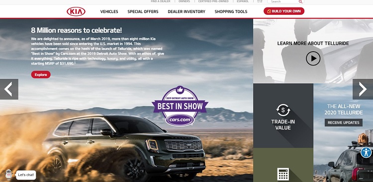
Kia uses a slider on its homepage with big images and arrows that make its purpose immediately clear. The slider takes up the entire top fold of the page, making it hard to mistake for a banner ad. The layout resembles an online magazine more than anything else, adding text details, headlines and features such as trade-in value and awards for each vehicle featured in the image.
2. Offer Personalized Images
Sliders provide an opportunity to tailor the user experience. For example, present new photos or fresh blog content each time the user lands on your page, based on previous browsing actions. Changing the images and text regularly on your landing page shows you're diligent about keeping your site updated and that you're active in adding new content.
3. Sandwich Between Navigation
If you're on the fence about whether to incorporate a slider, consider sandwiching it between navigation elements on your page. It adds interest while still allowing users to navigate where they'd like to go quickly. Adding the navigation elements also shows the slider isn't an advertisement, but part of the overall CTAs on the page.
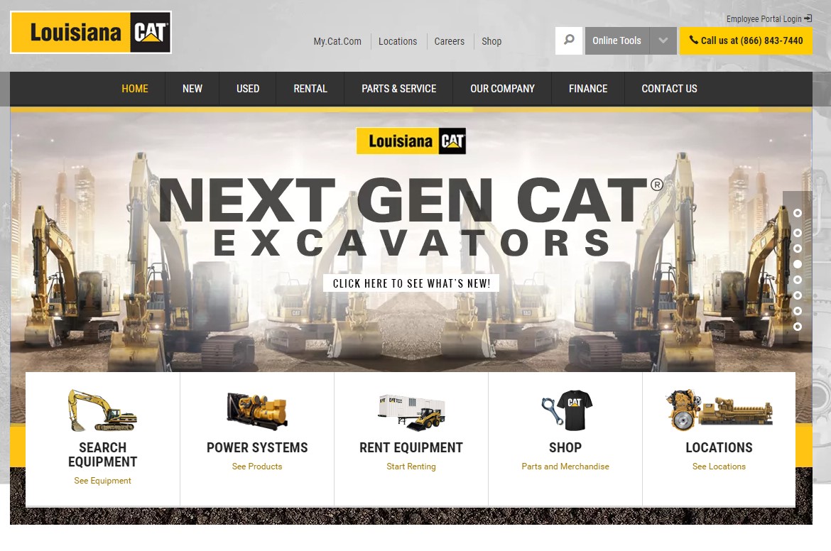
Louisiana CAT features a slider that rotates through different offers. The user can scroll up or down the selections if something grabs their interest and they want to pause on a topic. Above the slider is the navigation bar, and under the slider are additional navigation choices, depending upon what kind of equipment you're looking for.
4. Share Multiple Points
Sliders work well when you have several pieces of information for your site visitors, none more important than the other. You can shift through different sales offers or describe various products and services without taking up precious real estate on your landing page.
One use for a slider showcasing multiple offers is on an e-commerce website. You could feature one slide of your latest arrivals, a second with some of your clearance items and a third that details how to earn free shipping.
5. Create a Beautiful Design
A slider should mesh well with the rest of your webpage and not just look like an afterthought to all your other material. Navigation should match that of the rest of the page, and colors need to complement your brand color palette. A well-designed slider should look as though you developed the slider first, then built the rest of the page around it.
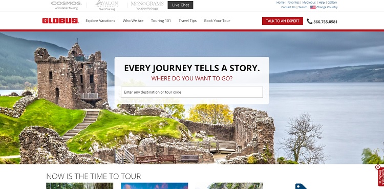
Globus provides tours for travelers and uses an automated slideshow on their website. The design on their site meshes well with all the other elements as the slider rotates through various destinations. They've placed a form right in the center of the slider, so the user can take action when they see an image that applies to them.
6. Target Mobile Users
Some more recent research suggests sliders work well with mobile browsers. Although there hasn't been a lot of additional research on how well sliders work since 2013, there was one study that looked at mobile usage and sliders in 2015. The info still isn't completely current, but it shows more people are engaging with sliders as mobile usage grows. They may not always click on the CTAs, but about 72 percent looked through the slides at least once.
One of the advantages of sliders for mobile devices is that the user doesn't have to scroll down endlessly, but can swipe to the right or left.
7. Highlight Other Products
When a visitor lands on your website, they're likely there because they already use one of your products or services. A carousel gives you an opportunity to introduce current customers to other products you offer. Highlight the newest and most exciting items in your arsenal. Existing customers are much more likely to buy other products from you than new customers, so use that connection you already have and make add-on sales.
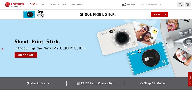
Canon uses its landing page to highlight some of their newest products and features. Note how they spotlight their IVY CLIQ, which prints out photos on stickers. Even if you already own a Canon DSL camera, you might be interested in something just for fun like the IVY. They also use one of the slides to highlight their community area, where they can continue to engage users and keep them as fans.
Sliders Have Pros and Cons
As with anything, there are pros and cons to using sliders. Web designers must decide if a slider is right for their page and determine the best rules for implementing a carousel on their page. Don't rule out sliders just because a couple of studies said they weren't that effective six years ago or more. Instead, use a slider if you think it makes sense for your site, and conduct A/B tests to see if it serves your - and your users' - purposes.
Related Posts
![Web Design]()
10 Best Website Design Tools to Create a Stunning Website
Creative and Design![The Future of Web Design and Front-End: Emerging Technologies]()
The Future of Web Design and Front-End: Emerging Technologies
Creative and Design![The Importance of User Experience (UX) in Web Development]()
The Importance of User Experience (UX) in Web Development
Creative and Design![Website Design Tips That Generate More Leads]()
10 Creative Tips to Design a Website that Generates More Leads
Creative and Design


Lexie is a designer and typography enthusiast. She enjoys writing HTML code and creating new styles guides. In her spare time, she works on her design blog, Design Roast.