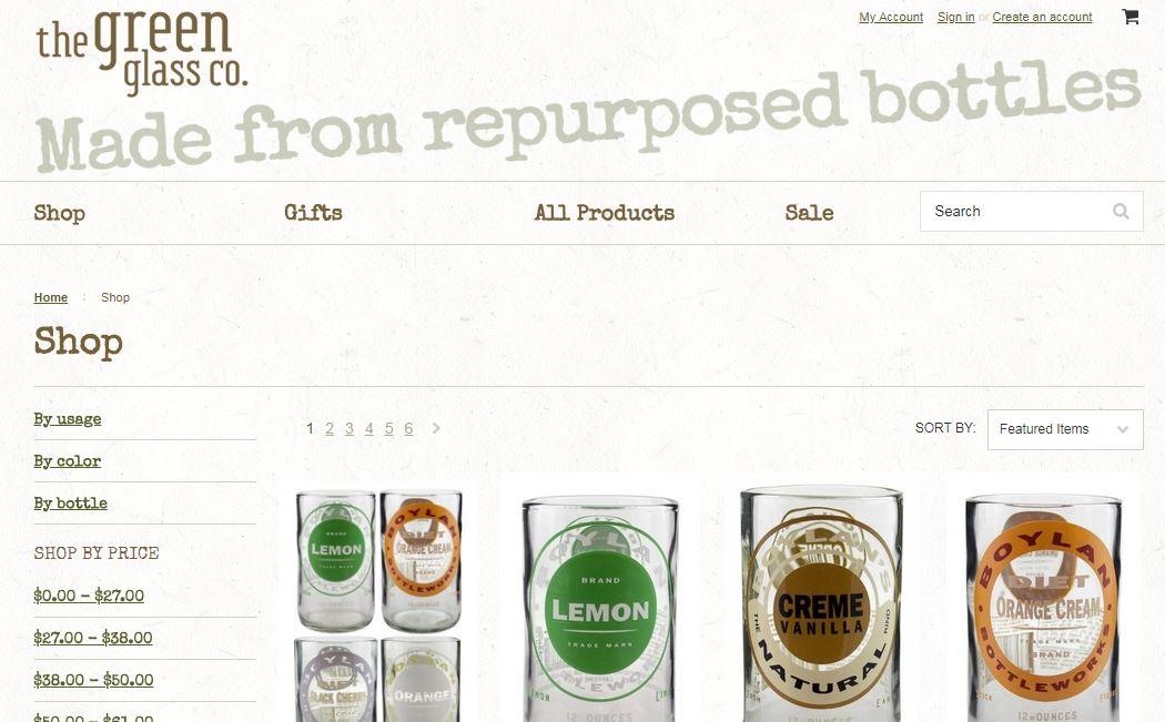
You have just a few seconds to make a first impression, whether it's online or in person. It takes a fraction of a second for people to form a first impression, meaning the look and layout of your website need to be on point.
However, knowing that first impressions are important and figuring out how to make a good one are vastly different. Fortunately, there are some rules of thumb about website design that can help impress first-time visitors to your site and make your page as user-friendly as possible. Here are six of them.
1. Create an Intuitive Layout
The layout of your page has to make sense to the user from the second they land on your page. If site visitors have to hunt for your navigational structure, you risk them bouncing away to a competitor's site instead.
Think about the majority of websites you've visited. Navigation appears in the top portion of the website, and the logo tends to be top left or top center. Because so many sites have the same layout, you know where to look for features before you even arrive at a site.

Pottermore does a good job placing elements exactly where you'd expect to see them. Even though a significant portion of the page is taken up with a full-screen-width image of the characters from the Harry Potter movies, a navigation bar is at the very top of the page. It shows how to get to various parts of the site. Featured news also appears within the top fold of the page, making it easy for users to locate the latest happenings.
2. Add Live Chat
People now live in an instant-everything world. If they want to watch a movie, they stream it that minute via any number of streaming services. They no longer have to wait for a favorite song to come on the radio. Simply pull up the song on their iPhone or Android and have it in an instant. They don't want to wait on customer service either, so adding live chat to your website gives users that instant access and lends another layer of credibility to your site.
3. Include Calls to Action (CTAs)
By the time a visitor lands on your page, they may have already researched the product they want, or maybe they were referred by someone else. Make it easy for that person to use your product or services by adding calls to action pushing them further into your sales funnel without having to read through entire blocks of text they may already fully understand.
Scarboro Garage Doors does an excellent job with CTAs on their landing page. Information about their product is easily accessible for those who need additional details, but if someone already knows they want to buy from Scarboro Garage Doors, they simply click on either the "Request Estimate" or "Request Service" CTA buttons located at the top, middle and bottom of the page.
4. Speed up Your Site
Although average page load speeds vary by industry, experts recommend as a rule of thumb that average speeds be under three seconds. The faster your page loads, the more people are likely to stay with it rather than bouncing away, including mobile browsers (more on mobile responsiveness below).
Some of the most successful websites in the world load in a fraction of a second. The last time you visited Amazon, you might not have thought about how fast the page loaded. However, consider how many elements Amazon offers on their landing page — images, links, information, sidebars and more. Yet the second you land there, the page is fully loaded.
5. Keep Content Fresh
Content still presents a big draw for site visitors. Not only does fresh content on your landing page show that you keep your site up-to-date and take the time to research topics your visitors find interesting, but it gives you a way of attracting visitors from social media as you share your latest posts and research.
Blog content is one of the top priorities of about 53 percent of marketers because studies show that content gets shared over and over online. Keep in mind that content includes blog posts, videos, infographics and other forms, so you aren't limited to written articles.

Wait But Why offers fresh content and an in-depth look at several interesting and relevant topics. When site visitors land on the page, they know they'll find something interesting about subjects such as picking a career, the human brain and better time management.
6. Ensure Mobile Responsiveness
Even though studies show that the majority of visits to retail websites across all industries still come from PCs, mobile device usage is on the rise. Tap into the growing market by ensuring your website is ready for mobile. If someone lands on your e-commerce site via a smartphone, is it as easy for them to order as it would be from a PC?
Ensure your page appears in the right size and adapts to different screen sizes. Make sure to test your site to make sure it looks good on both PC and mobile.
Test Your Landing Page
Ensure your landing page meets visitor needs by conducting A/B testing on various elements. If you think your CTAs aren't quite measuring up, make a change and test the results. Go through each part of your landing page until it coverts as highly as you'd like. With a bit of attention to the small details, you'll find that visitors respond positively to your site.
Related Posts
Lexie is a designer and typography enthusiast. She enjoys writing HTML code and creating new styles guides. In her spare time, she works on her design blog, Design Roast.


