Working on the appearance of your new WordPress site is going to take you a lot of time. You have to choose from thousands of themes, customize your chosen theme, create menus, add follow buttons, and more.
If you want your website to look good, you have to work on it. Evidently, there are lots of articles that can help you achieve beautifying your website.
As a matter of fact, to help you improve the appearance, I'm going to help you brand your new WordPress website real quick.
Four Quick Ways To Keep Your WordPress Website On Brand
1. Logo
When you're customizing a theme, you'll have the option to select a logo you want to display on your home page and other pages of your website. It depends on the theme where your logo will be located and you get to also customize the size of it.
My advice, before you get started with setting up your WordPress, make sure you already have a logo so you're not in a rush to design one and to complete the appearance of your website. There are plenty of logo design tools that can help you create a professional one on your own.
But if you're not in a hurry and you have an hour or two to spare, you can go to a logo crowd-sourcing website like 48hourslogo where you can hold a contest for logo designers. Whoever designs the best logo for you, wins.
2. Favicon
Speaking of logos, you'll need to have a 512 x 512 pixels version of your logo design for your Favicon. Do you know that image on the left of your web browser tabs? That's called a Favicon. It's obviously also a logo but when you're a WordPress person now, you call it a Favicon.
When you're optimizing your website for search engines, having a Favicon is important. Website SEO checker tools count this as a search engine optimization point.
3. Images
Visuals are everything! Whether you're a photographer or designer or not, you want to make your website visually attractive to your visitors. It's highly suggested by experts and top bloggers that you keep your pictures or visuals you use on brand. They should all be visually in sync.
There should be one or two design elements that you always use for your website's images.
Here's a good example, PostPlanner's blog cover images. See how they always use this shade of green and use hand-drawn images as their main element. 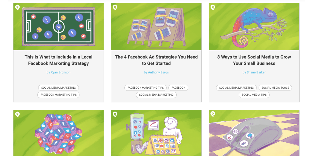
If they use a different type of green or another color for their next blog post, they will completely go out of brand. They have established a visual brand image among their audience and this is something you want to achieve as well.
4. Social Media
When you're building a website, it's by default that you want to connect your social media pages so your audience can follow you there.
It's a highly good practice to use your website domain or name as your social media handle so people can find you easily. For example, Visual Contenting. They use @visualcontenting as their Instagram handle. Consistency is part of branding.
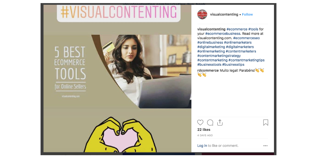
You also want to use the same profile picture for all your social media accounts so people won't get confused and even spend the time to figure out if that's really you or someone else.
What Do You Think?
Did I miss something? Please let me know by leaving a reply below ?
Belle Balace is the Marketing person in LogoAi.com, an online tool that generates logo designs for you.
