We live in a highly digitized world. People see advertising on billboards, television, in printed material and online. Every day, we create about 2.5 million terabytes of data, which equals 310,000 photos, thousands of hours of music, millions of pages of novels and 86 million MS Word documents. We are drowning in data.
Data overload makes visualization more important than ever. Turning your data into digestible visualizations people can glance at, absorb and move on helps your business stand out from the competition. It also allows them to process the information more rapidly and remember it.
Only 10 percent of the words we hear stick in our brains three days later, but if we see an image alongside those same words, the remembrance goes up to 65 percent. It makes sense that adding images to your data makes people remember information longer and better. Here are six ways for incorporating data visualizing into marketing campaigns.
1. Turn the Info into a Game
One way to present data is to gamify it. Think of ways you can make the information fun. Imagine how the old School House Rock! videos could take a complicated concept, like how a bill becomes a law, and present it in a fun and informative way. Now, do the same thing with the data you want your potential customers to have.

Why Do Buses Bunch? offers a look at why the transit system backs up if one bus in the bunch slows down or stops for too long. The data visualization works similar to a short game. If you hold down the bar, it delays one of the buses. The visualization shows the bus behind that one quickly catches up, but then it too gets delayed.
2. Grab Their Attention
Studies show the average person has about the same attention span as a goldfish. Keep their attention by presenting data in an exciting way they haven’t seen before. Study how your competitors share similar data and figure out how you can present it better. If a consumer must choose between your competitor’s data and your data, you want them to choose you every time.
3. Add Interest
Images add interest to basic facts. As the saying goes, a picture is worth 1,000 words. Adding images allows you to cut down on the number of words you use and makes the meaning clearer than without images. However, those images have to be relevant to the topic at hand. Finding pertinent images that tie all the data together isn’t always an easy task, but it’s worth the effort.
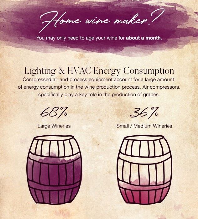
Quincy Compressor explains the process of making wine at home through an infographic that clearly illustrates the different statistics around energy consumption and how their compressors work. They tie all this into the process of making wine from grapes, demonstrating how much of a role air compressor play in the process.
4. Include a Clear CTA
It’s important not to overlook adding a call to action (CTA) to your visualizations. For example, if an infographic excludes a CTA, the reader may absorb the information and then move on without taking the action you wanted them to. Don’t worry about being too obvious with your CTA.
5. Use Animation
Don’t be afraid to use animation to draw attention to your data visualizations. Animation tends to pull the reader into the topic at hand. Of course, you don’t want to overdo it and add too much animation. It’s distracting to have animation completely taking over a page, but animating one graph works nicely.
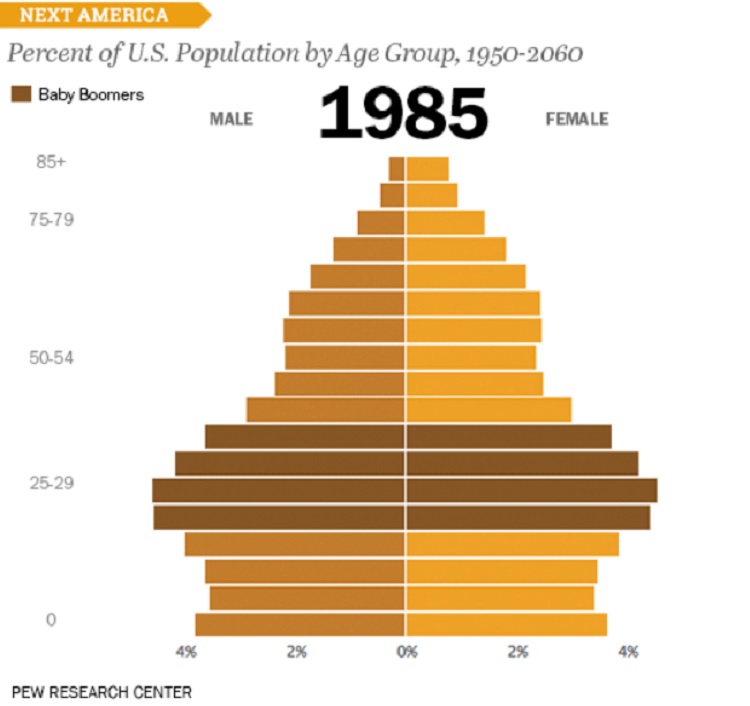
Pew Research takes the percentage of the U.S. population from year to year and shows the changes with a darker brown highlight that animates up the scale as the years change. As part of a larger report, the animated graphic adds visual interest to statistical information and makes it easier to understand and follow.
6. Tell a Story
If you’re like most businesses, you have a lot of data to sort through and possibly present to readers. You have to break down all that information and find the story behind the statistics. Some narratives allow you to develop an overarching story.
- Take a look at trends. Are things changing over time?
- Look at rank. Is your market No. 1 among consumers year after year?
- Compare two things. Does adding your software increase productivity by 30 percent? Compare using the software and not using the software. Or, compare your software to another company’s that doesn’t perform as well.
- Look for surprising data. Are there any trends you didn’t expect to see? What might explain them? Share that story with readers.
- Explain why data is trending. Why are more people buying emergency supplies in September, compared to other months? Are they preparing for the height of hurricane season?
Look at the data as a whole and identify the reasons for the data.
Adding Data Visualizations
Start with one or two data visualizations that break down complex data. Later, focus on longer data visualization content such as full infographics or even a whitepaper with text and data visualizations scattered throughout.
Data is a vital part of storytelling. Anything you can do to make information more interesting and hook the reader offers a competitive edge. Pair big data with excellent visualizations for maximum impact.
Related Posts
Lexie is a designer and typography enthusiast. She enjoys writing HTML code and creating new styles guides. In her spare time, she works on her design blog, Design Roast.


[…] How to Incorporate Data Visualization into Your Next Marketing Campaign […]