It’s never been easier to get started with an online store. However, it’s more difficult than ever to make it look professional and stand out from the crowd. With competition in abundance and more eCommerce sites popping up in every sector, an unprofessional, ‘ugly’ website can be the difference between big success and total failure. No modern consumer wants to shop on a hard-to-use, clunky site. And looking unprofessional can lead to distrust, which will undoubtedly drive potential buyers away.
Appearances are important. Especially in an online world dominated by online conglomerates such as Amazon, with 42% of consumers saying they receive one or two Amazon packages every week. Failing to match customer expectations results in customers leaving for a competitor - and they will likely never come back. You lose business revenue, reputation, and credibility.
If you can’t provide value, delivered on a clean and professional website, along with an impressive customer experience, you’ll find it had to thrive. The big question, therefore, is how do you make your store look more professional for your audience? Here are five simple ways to quickly up your game.
#1: Use a WordPress Page Builder
Possibly the most simplistic way to look professional is to use a WordPress page builder, making the design process incredibly easy. These page builders, such as Elementor, enable you to keep your favorite WordPress theme and customize it as you please. From landing pages to web pages to blogs, product listings and more, a page builder can essentially be used to fully design any page or post type within the WordPress platform.
Best of all, it’s incredibly fast (for instance, Elementor allows you to design on the frontend with instant, real time results), and provides every design feature you'd need to upgrade your site. The easy to use tool requires no coding, resulting in high-end designs optimized for every device. Say hello to a designed, professional website, and goodbye to clunky, unprofessional pages.
#2: Simplify Your Site Navigation
Your eCommerce store will instantly look unprofessional if your navigation is messy. You might want to display everything - products, information, blogs, email opt-in form, and services - all at once, but it’s easy to turn-off customers if you appear cluttered and hard to use. A clean, crisp layout is vital here. Aim for the right proportions between images, content and white space, and don’t clutter pages with various ads, banners, buttons, products, too much copy and icons.

Your menu should have two qualities above all others:
- Easy-to-use
- Informative
Less is more in this instance. To improve your website’s usability, think about the font you use (and ensure it’s all the same size with the same formatting), and the nav must be optimized for all devices - smartphones, tablets, desktops, TV screens and so on. If you web nav disappears or becomes unformatted on different devices, it gives a bad impression.
#3: Use Enticing Imagery
You should use good-quality, high-resolution images throughout your site. You could have the best website in the world, but if it looks rubbish, it won’t do the job you want it to do. In a single second, good images can attract or repel your customers. You don’t want to waste all the time and energy you’ve put into building your eCommerce store by having unprofessional images.

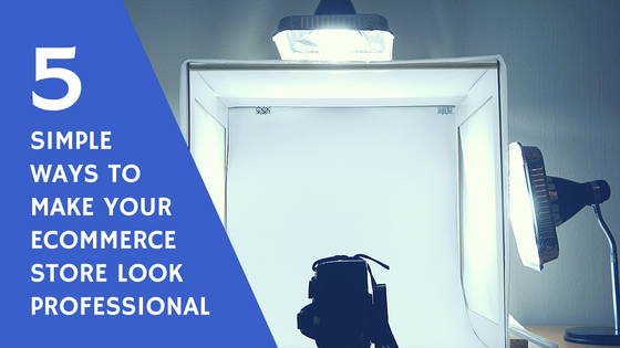
To generate sales, your products need to be seen in their best light. Poor quality images, unequal sizing, bad angles, and more are going to make your sales stutter. Expert product photography results in clear, realistic, high-resolution images; this will give prospects an idea of what you are all about and what your products are. Try a mix of products on a crisp white background and products in action -- perhaps on a person if it’s clothing, for example.
#4: Adopt New Technologies
One quick way to look slick is to implement exciting technology that is already being used by market leaders. From inventive pop-ups to personalized offers, there are tons of features and functions provided by new tech.

One of the best is a chatbot, which can be used as a virtual shopping assistant. Instantly leverage an effective marketing and sales tool and make your store seem professional, friendly, and helpful. Other creative options you could consider implementing to make your store look more professional include animated graphics, exit-intent offers, and videos.
#5: Ensure that Your Brand Is On-Point
If someone comes to your eCommerce store and your branding looks poor, it doesn’t give off the best impression. Your logo should be designed, unique and represent your brand. It should be presented clearly in your store - which will automatically give your visitors a sense of dealing with a professional business.

A logo can make a surprising difference. The most prominent brands in the world will tell you that their logo builds trust and plays a crucial role in customer experience. So, remember, your logo serves as the face of your company, and it’s what your audience will remember. Nail it, and you’ll come across as the real deal. Get it wrong, and you’ll come across as an amateur outfit. Ensure that your branding is consistent across your homepage, product page, connected social channels, and all of your promotional materials.
Recommended: How to Build Your Brand from the Outside In
Conclusion
These five ways to make your store look more professional are easy fixes that can result in a big difference. Your eCommerce store needs to be as professional as possible to attract and convert your potential buyers, and it’s not hard to achieve. With a little effort, you can make the changes to drive sales and help your business grow.


[…] 5 Simple Ways to Make Your eCommerce Store Look Professional […]