A strong call to action (CTA) gives your site visitors clear instructions on what step to take next. It's easy to put a CTA button in place and then forget about it, but high-converting sites consistently change things and tweak even small elements on the page.
It's important to know that 90 percent of visitors who read your headlines also read your CTA copy. The CTA has the power to convert visitors into customers and drive people through your sales funnel. Here are some tips to help you boost your CTA effectiveness.
1. Offer Something of Value
Marketers understand the value of the CTA button. Today, you'll see a CTA on nearly every landing page you visit. If you want your CTA to stand out and grab the user's attention, you have to make sure the user has a reason to click on the button in the first place. Offer something of value that the user can't get anywhere else.
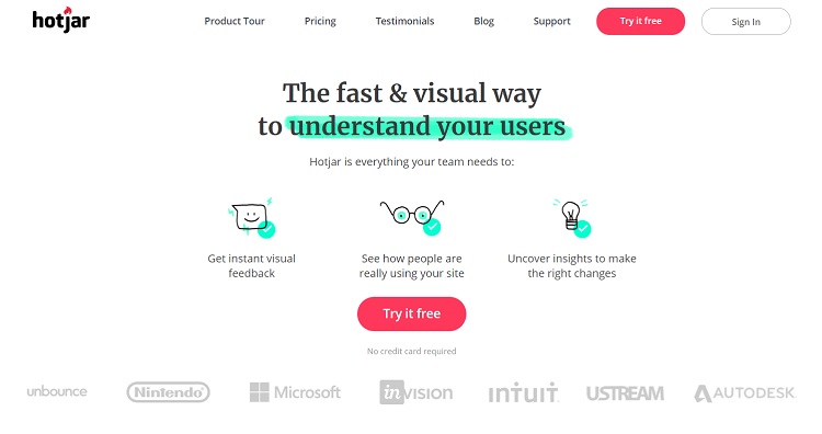
Hotjar does a good job of offering something of value with their CTA button. They invite the user to "try it free." The site provides heat maps for website owners, so they can see the best way to improve their sites.
2. Animate Your CTA
Interactive objects are much more effective when they're animated. For example, the CTA button might change in some way when the user hovers over it. Animate your CTA button to make the site even more interactive for your users and encourage action.
3. Be Upfront
So many things online are designed to trick people. Remember all the clickbait articles a couple of years ago and how frustrating they were? Today's consumer is savvy and doesn't like companies who aren't upfront and honest about their purpose or offers. Take the time to be transparent, and customers will respond to you more positively.
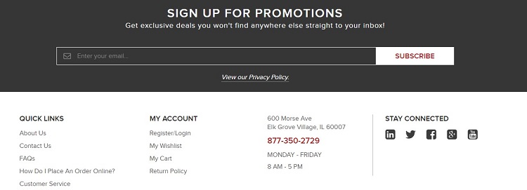
Cherry's Industrial Equipment is upfront about what the user gets by signing up for their mailing list. They simply invite the user to sign up for promotions and explain that they'll send exclusive deals. The CTA itself reads "subscribe." Cherry's Industrial Equipment doesn't try to hide what they're offering or sugarcoat it. They simply present what you'll receive in exchange for sharing your email address.
4. Keep Your Eye on the Goal
Your landing page should have one goal — to convert visitors into buyers or subscribers. With that in mind, avoid cluttering up your landing page with so many different things that the user can't find the CTA. Your CTA should be the one thing the user hones in on the minute they land on the page. If you put too much other stuff on the page, you risk losing them to the "stuff" and not the action you want them to complete.
User heat-maps allow you to see where users are hovering and clicking on your page. What if they go to an area of your site that you don't even care if they visit or not? If it's a possibility, remove that link and info from your landing page.
5. Offer a Value Proposition
What is the value of your product, and how can you show it to the user? Your goal as a business is to get people to use what you sell. If you sell a service for website owners, you'd likely point out how you can help them succeed and show them an example. If you sell a food product, you might offer recipes or cooking guides that show how people can use what you provide in their day-to-day lives.
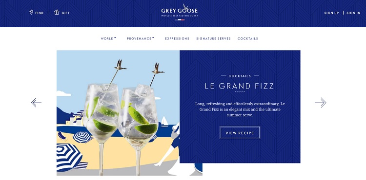
Grey Goose Vodka does an interesting thing with their calls to action on their landing page. They know that their best chance of getting people to buy their product is getting them to use the product, so they offer recipes. The recipes rotate on a slideshow, and the CTA buttons read "view recipe."
6. Add Videos
CTAs within videos get as much as 380 percent more clicks than others. However, there are many variables involved in adding videos to your marketing efforts. If the video isn't high-quality, it might hurt your brand image. If you can't afford to produce a decent video, it might be better to wait to add videos than to add one that's low-quality and makes your operation look unprofessional.
Recommended: Video Marketing – How to Incorporate Video In Your Strategies
7. Choose Your Words Carefully
The wording of your CTA makes a big difference in your overall conversion rates. In one study, a website achieved a 90 percent increase in their clickthroughs by adding first-person wording instead of second person wording (me instead of you).
Keep in mind that people see the word "subscribe" quite often and may simply skip over it because of its familiarity. Try to come up with something short that describes the action you want the user to take but that's also personal. For example, "get my free ebook" or "send me special offers" are good choices because they describe what happens when the person clicks on the CTA button, but they're also unique to the site and offer. Note the use of first-person in the two examples provided in the previous sentence.
Recommended: 23 Words and Phrases to Eliminate from Your Writing Today
8. Study Competitors
Take the time to visit your competitors' websites. What do they do well with their CTAs, and what can be improved? You can learn a lot about what to do and what not to do by studying other successful business landing pages. Take the time to thoroughly test any changes to your CTAs with A/B testing. With time and patience, you'll find the perfect combination that makes your site stand out and improves your overall CTA conversion rates.
Related Posts
Lexie is a designer and typography enthusiast. She enjoys writing HTML code and creating new styles guides. In her spare time, she works on her design blog, Design Roast.

