Data visualizations tell a story in a way that simple text doesn't. Most people don't do well with a lot of facts and figures thrown at them. However, taking that same information and creating charts, graphs and images make the information more digestible and interesting.
Mordor Intelligence created a report that delves into the data visualization market for the next five years. They found the fastest-growing market was North America, with a 9% growth rate through 2025. Companies now understand the importance of images in sharing data with their target audiences.
However, when it comes to using data visualization on the web, some business owners feel lost. What types of data should you share and how should you disperse it? We've come up with a list of do's and don'ts which will help you as you embrace a new type of content for your online presence.
Do Pay Attention to Contrast
You likely already know that your designs need to have strong contrast so they are viewable on different types of devices and screen sizes. You'll also help those with vision impairments see your data more clearly.
The same rules apply to data visualizations. A map of the areas you serve shouldn't use light blue on medium gray, but maybe a deep navy blue on the lightest sky blue instead. The more contrast, the better. If you're not sure if your design has enough contrast, step back from the computer and see if everything is still clear.

CrimeMapping.com works with local police departments to provide crime mapping technology. What works really well with this particular style of data visualization is the use of icons to represent different crimes. The user sees at a glance what type of crime was committed where, such as a robbery. Users can also view a chart to see how many of each type of crime occurred on each day of the week.
Don't Skew the Data
You may be tempted to misrepresent or change the data to make your business look better. If you can't run a report that sheds a positive light on your business, then either don't share the information or choose different types of data.
Never try to make it look like you're getting results for customers you aren't actually achieving. Not only is it dishonest to provide false information, but the truth also has a way of coming out and you'll damage your reputation.
Do Use Your Brand's Color Palette
The colors of your data visualizations should tie into your overall color scheme so they match up to the look of your website and any design elements in your style guide.
When people see the visualization, it should have a certain feel so they know immediately the information came from you and not another source. If you post the image on your social media page, how will visitors who see it while scrolling past know it's from your company?

iSpecimen uses big, bold percentages in a font that matches the rest of their design. Note the colors of their graphics and how the colors tie into the scheme of the website with green, blue and orange shades. The data visualizations mesh well with the rest of the site, keeping the flow of the page intact.
Recommended: Various Uses of Color in Web Design
Don't Forget Your Math
One thing you might have noticed from the graphs and pie charts you've seen on other sites is that the numbers don't always add up. Keep in mind that a pie chart or graph should always equal 100%. If you have percentages that are over or under 100 when added together, then something is off in your data. Putting out bad math makes you seem unreliable.
Do Keep Your Designs Simple
There's no need to create something complex and hard to read. The idea of data visualization is to make it easier for users to understand data. Keeping your designs as simple as possible makes the information absorbable. Even the graphics you use should have a simple or minimalist quality to them that doesn't distract from the data itself.
Don't Try to Share Everything
Data visualizations should have a very narrow focus. Don't try to share too much information at one time or users may grow confused.
Think of infographics as slices of information. You want them to be easy to process, so keep them short and to the point. You can always create additional images to show more information. You don't have to write a "book" with your first few images. Think of them as "paragraphs" instead.
Do Explain a Process
Data in pictures instead of numbers is all well and good, but there isn't much point to just throwing up a few images of figures if you don't have a purpose behind them. Know the purpose behind why you're sharing the information.
Explaining a process or result is one way to ensure your data is relevant to users. Think about the information they're most likely to care about.
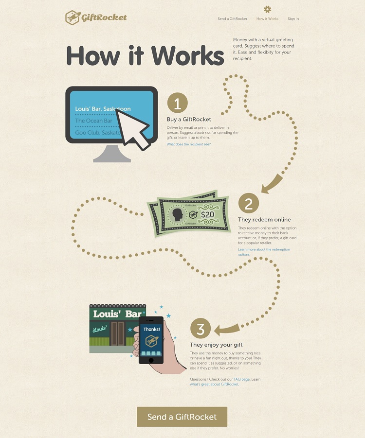
GiftRocket uses images and simple arrows to explain the process of buying through them. The headlines hit on the main points, but the smaller text details what happens at each stage of the journey. The data visualization ends with a strong call to action (CTA) button that reads "Send a GiftRocket."
Add Data Visualizations Today
As more and more people access the internet using their smartphones, they want information that is easy to absorb between meetings or while waiting in line. Data visualizations give them something quick to process, as the human brain understands images faster than text.
Start with a few basic additions to your online presence and then grow from there. Keep these do's and don'ts in mind to hit all the main points your customers would like to see.
Recommended: How to Incorporate Data Visualization into Your Next Marketing Campaign
Related Posts
Lexie is a designer and typography enthusiast. She enjoys writing HTML code and creating new styles guides. In her spare time, she works on her design blog, Design Roast.
