Does your eCommerce site leave something to be desired? If you have a high bounce rate or customers abandoning their carts, then it’s likely time to take a step back and figure out ways to fix what isn’t working.
The business-to-consumer industry alone is worth $1.2 trillion in the United States. Add to those numbers the business-to-business figures, and you can see why companies invest in eCommerce.
However, there is a lot of competition in the marketplace. While it’s hard to say how many eCommerce stores are on the internet at any given time, the answer could range from tens of thousands to around a million. That means you better make sure your site works for your customers or they will simply go elsewhere to do business.
Lacking Focus
Is your eCommerce store trying to be everything to everyone? If your store lacks focus, consumers may feel uncertain as to what they can count on from you. This makes them less likely to return to your store again. It also is confusing for a site visitor who is looking for a specific niche product and instead finds a large number of different categories.
Fix this by choosing what your niche area is. If you sell golf products, don’t suddenly add perfumes. Try to stick with anything related to golfing instead.
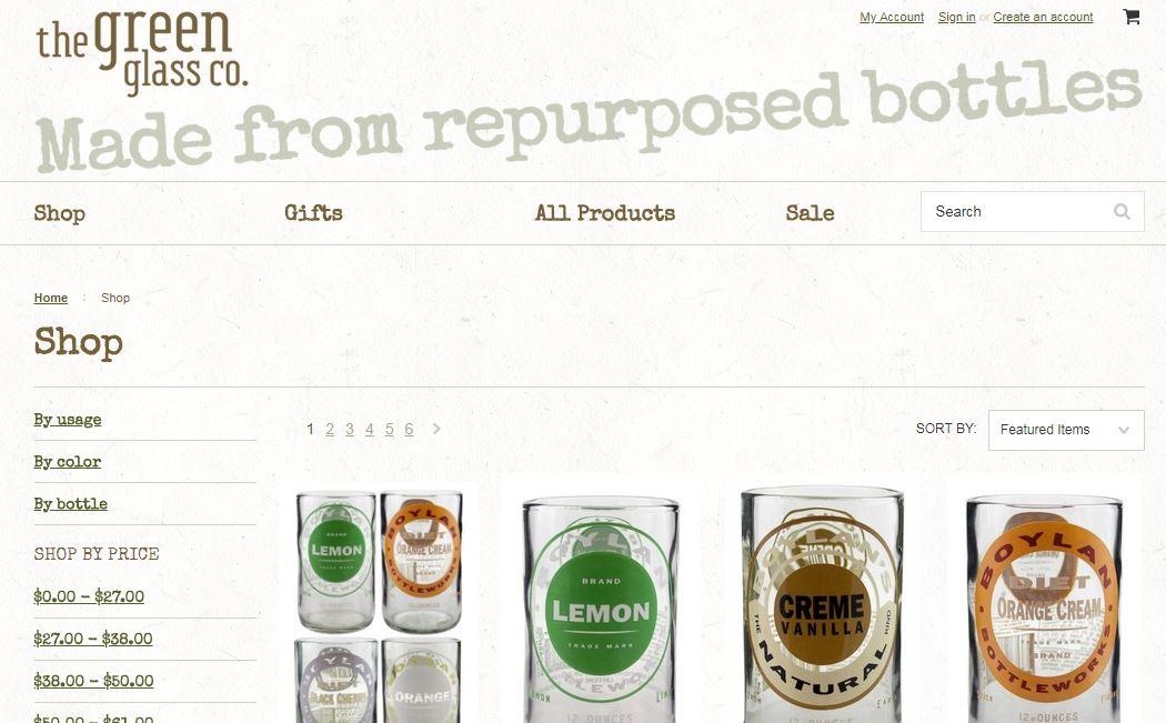
The Green Glass Co. does an excellent job of staying within its niche, which is creating products from recycled glass. If you search through the selections, everything is within this theme. It offers drinking glasses made from recycled glass. The designs vary, but it is always the same theme.
Making Products Hard to Find
People today are extremely busy. You can lose their interest in mere seconds. It’s vital that you grab their attention from the minute they land on your site, but also make their experience as smooth as possible so they don’t become frustrated and bounce away.
Fix this issue by making sure your navigation is clear. Include a search feature, so items are easy to find if not listed clearly in a defined category. Utilize breadcrumbs so visitors can track back to a product they were interested in.
Missing Specials
If your site doesn’t make it clear what is on sale and what the special offers are, then you’re missing a big opportunity to hook visitors. From the moment the site visitor lands on your page, he or she should know what’s on sale and find the sale items easily.
Fix this issue by adding a slider, a call to action button or some other eye-catching notice about what’s for sale on your site at any given time. Make sure it’s relevant to your niche.

 Wing Tactical does a good job of showing some of its featured products. While this isn’t always a sale item, it is something of value to its typical target audience. The slider is used to show new items, featured products and specials.
Not Adding Enough Detail to Descriptions
Are your product descriptions lacking? If you want a customer to make an informed decision about whether or not to purchase your product, then you need to add enough detail to your descriptions for the consumer to gain a thorough understanding of what you’re offering.
Fix this by looking at your product descriptions. They should go more in-depth than price and size. You need to write a thorough description of any special features and typical uses for the consumer.
Missing Reviews
Does your eCommerce store feature reviews of your products by actual people who’ve purchased and tried the product? Most people look at reviews before making a decision to buy online. Over 88 percent of online shoppers look at reviews before buying.
Fix this issue by adding a feature where customers can add their own thoughts about a product they’ve purchased. Remind them to review the product once you’ve fulfilled the order and they’ve had enough time to try it out.

 Soap Co. adds an option for customer reviews under its individual product listings. Even though you have to click on a tab to see the review, it clearly lists under the name of the product that there are a certain number of reviews and how many stars the item has overall. If you want more detail, you simply click on the reviews tab to see what others are saying.
Using Bad Images
Does the image really highlight your products in the best light? If your product photos look amateur or the lighting is poor, the consumer may not be able to see if the item is the correct color or has other needed features.
You can fix this item by ensuring you have good light and use the best camera you can afford — or hire a professional photographer. The image should be displayed from various angles, so the consumer can see all the details.
Overpricing Items
How do your prices stack up to the competition? While you’re in business to make a profit, if your prices are higher than competitors, you can’t blame consumers for going elsewhere to save money.
To fix this, study what your competitors are doing. If their prices are much lower, then talk to your suppliers about lowering your own costs to be more competitive. If you don’t offer free shipping and your competitor does, then you’ll need to figure out ways to do so.
Wish offers items at highly discounted prices, and it highlights them to draw people to the site through advertising efforts via their app and on social media. It doesn’t try to push that its items are quality — because many aren’t — instead, it pushes the pricing. This is an area where Wish has worked to be competitive, and it is.
Looking Untrustworthy
Consumers want to do business with a company they feel they can trust. If you look untrustworthy, then they may be scared to trust you with their money. Your online reputation can also impact how consumers see you. Small mistakes in the beginning stick with you for years to come.
Fix this issue by gaining certification through trade associations and customer watch groups. Put testimonials and reviews up front and center.
Confusing the Customer at Checkout
If your checkout process is too time-consuming or confusing, then you risk customers abandoning the cart and never returning. Take the time to walk through your checkout process by playing your own customer. Is everything clear and easy to complete? How many steps are there?
Fix this issue by testing your checkout process thoroughly. If there are more than a few steps, figure out how to reduce them and make checkout easier.
A Better eCommerce Site
Fixing minor issues as you go along helps your eCommerce site smoother for consumers to navigate. You should consistently seek to improve the process your customers use to order from your site. With a little extra work and attention to detail, you should improve your bottom line and turn more browsers into customers. You’ll see big payoffs from your efforts.
Related Posts
Lexie is a designer and typography enthusiast. She enjoys writing HTML code and creating new styles guides. In her spare time, she works on her design blog, Design Roast.


